
The Psychological Impact of Subtlety: Mastering Muted Bedroom Colors
We often approach bedroom design as a purely aesthetic exercise, selecting colors based on personal preference alone. However, when we examine the psychological mechanisms at play, color choice becomes an act of environmental engineering. Specifically, employing **muted bedroom colors** does not simply change the visual backdrop; it directly modulates the occupant’s physiological and psychological state, fundamentally altering how the space functions as a sanctuary. We observe from the data that high-saturation colors, characterized by intense spectral energy, increase visual stimulation, prompting alertness and potentially elevating heart rate. Conversely, lower-chroma tones—those incorporating significant amounts of grey, beige, sage, and dusty blues—allow the visual field to rest, engaging the parasympathetic nervous system. This shift facilitates a transition from a state of high cognitive load to one of deep relaxation, which is precisely the desired outcome for a sleeping environment.
Deconstructing Color Theory in Sleep Environments
The strategic application of color involves understanding light reflection and psychological association simultaneously. When walls are painted in soft, desaturated hues, they absorb ambient light rather than aggressively reflecting it back into the room. This reduction in visual intensity lowers the overall sensory input received by the occupant throughout the day and night. For instance, warm greys introduce an earthy grounding quality, which has been shown to reduce perceived stress levels, whereas cool blues trigger a sense of spaciousness and calm. The specific balance between these undertones dictates the room’s operational mood; a slightly warmer muted palette encourages coziness and intimacy, while cooler tones promote a more serene, expansive feeling suitable for deep rest.
Our analysis suggests that the impact is amplified when considering circadian rhythms. Exposure to overly stimulating colors late in the evening can suppress melatonin production, delaying the onset of restorative sleep cycles. Muted tones mitigate this effect by minimizing the visual stimulus that signals alertness to the brain. This subtle calibration allows the body’s natural sleep preparation mechanisms to engage more efficiently.
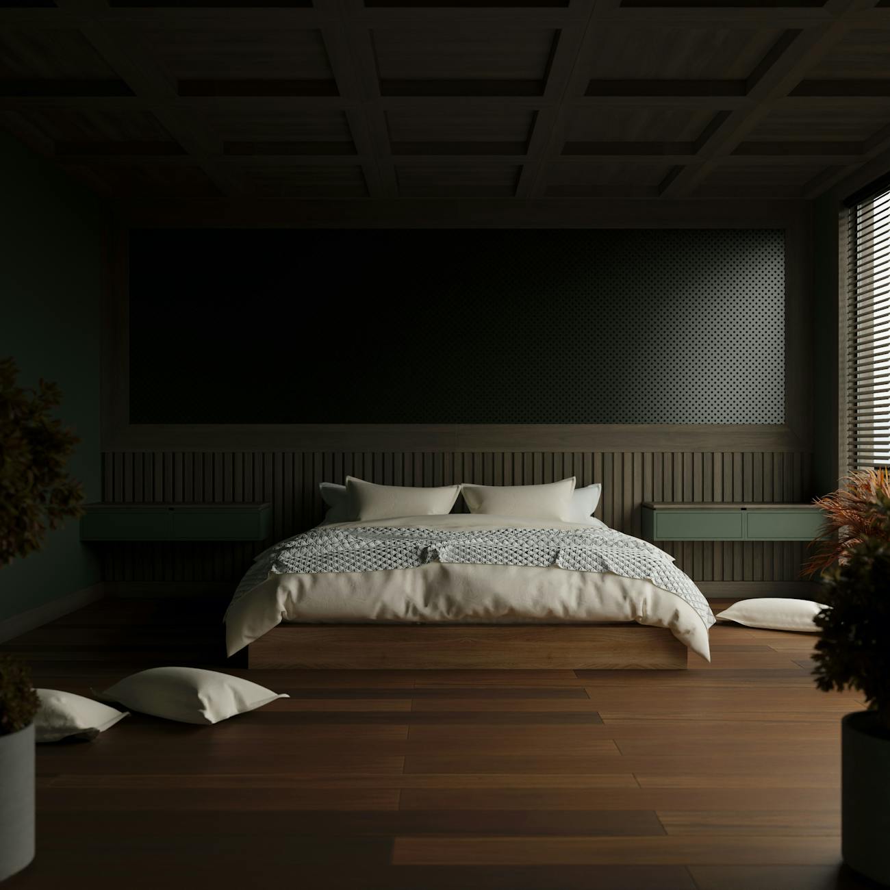
The Spectrum of Serenity: Sage, Dusty Blue, and Warm Greys
The selection process moves beyond simple liking; it becomes an exercise in functional psychology. Consider the specific tones frequently employed in creating a tranquil atmosphere. Sage green, for example, connects the interior space to the natural world, offering a sense of organic balance that is inherently calming. Dusty blues introduce depth and tranquility, reminiscent of clear skies or still water, effectively dampening visual agitation. Warm greys provide an essential neutral anchor; they offer sophistication without introducing sharp contrast that can feel jarring in a bedroom setting.
These colors work together not as isolated entities but as components of a cohesive atmospheric system. When these tones are layered intentionally, the room achieves a unified sensory experience. We see this effect when designing spaces where textiles play a significant role; layering soft, natural fabrics over walls painted in muted colors enhances the tactile experience, further cementing the feeling of safety and envelopment. For instance, layering textiles for a cozy home office demonstrates how manipulating texture alongside color amplifies the sense of physical comfort, creating an immersive cocoon.
Practical Application: Implementing Muted Bedrooms
Implementing this aesthetic requires intentionality regarding material selection across the board. The choice extends beyond paint swatches into the tactile experience of every surface in the room. We must consider how these muted colors interact with natural light sources throughout the day. Rooms bathed in soft, indirect illumination benefit immensely from matte finishes, as glossy surfaces create distracting reflections that increase visual activity. Therefore, selecting matte finishes for walls and furnishings is a mechanism to control light intensity directly.
The textural interplay is equally critical. Introducing natural materials—linen, wool, raw wood—into a space dominated by muted colors introduces necessary organic variation. This contrast prevents the muted palette from feeling flat or sterile; instead, it establishes a rich, lived-in quality. Think about how these elements influence daily routines. When you interact with soft textures while reading or winding down, your sensory engagement shifts toward tactile comfort rather than purely visual processing.
Integrating Functionality with Atmosphere
Creating a serene bedroom is not solely about passive color selection; it involves structuring the environment for optimal function. This means ensuring that aesthetics support restorative sleep cycles and daily routines without introducing friction. We observe that the ability to create intentional zones is paramount when living in smaller spaces, such as tiny living rooms where maximizing usable area becomes a design imperative. Effective spatial planning, perhaps by utilizing vertical space thoughtfully with smart storage solutions, reduces visual clutter, which directly translates into mental clarity.
When organizing items, the muted backdrop acts as a neutral canvas upon which functional objects can be clearly perceived. Clutter introduces cognitive friction; a visually chaotic environment demands processing power. By keeping the color palette subdued, we reduce this background noise, allowing focus to remain on the essential elements of rest and personal connection within the space. The goal is to engineer an environment where visual input supports decompression, not further stimulation.
Achieving Depth Through Subtle Contrast
The challenge in utilizing muted tones successfully lies in avoiding monotony. If every surface shares the exact same low saturation level, the result can drift into a monotonous wash rather than deep tranquility. Expert curation involves introducing subtle variations in tone and texture to create visual depth. This is achieved by playing with tonal relationships—using shades of grey alongside warmer taupes or cooler slate blues—rather than sticking rigidly to one narrow band.
This nuanced approach allows the eye to perceive complexity without being overwhelmed. For example, pairing a dusty blue wall with creamy white trim introduces a gentle demarcation that provides structure while maintaining overall softness. This sophisticated interplay elevates the design from merely “calm” to deeply intentional and layered. We are not aiming for stark simplicity; we are aiming for nuanced harmony where every element contributes to the overarching sensation of peace. Mastering the art of **muted bedroom colors** is mastering the subtle mechanics of environmental influence on human well-being.
Tags: muted bedroom colors, bedroom decor, color psychology, cozy home, bedroom palette, calm decor, neutral tones
Featured Image by Moises Arias on Pexels.