
The Psychological Impact of Soft Palettes on Interior Ambiance
We observe a distinct correlation between the chromatic choices within a living space and the psychological state of the occupants. When selecting color schemes for cozy home decoration, we are not simply choosing visual accents; we are manipulating ambient light and emotional processing through wavelength interaction. Pastel colors achieve this effect by reflecting diffused light across larger surface areas, which inherently reduces visual tension compared to high-saturation tones. This effect is particularly pronounced in spaces designed for relaxation and restorative activity.
The mechanism at play involves the reduction of visual stimulus load. Bright, intense colors force the eye to engage intensely with the visual field, demanding more cognitive processing power. Conversely, muted pastels introduce a low-intensity visual background. This allows the mind to enter a state of passive reception rather than active analysis. This physiological shift is crucial when designing environments intended for unwinding after demanding daily routines.
Deconstructing Color Psychology in Soft Tones
Pastel color schemes tap into established psychological associations with softness, innocence, and tranquility. Blush pinks, for instance, trigger responses linked to warmth and gentle affection. Sage greens evoke a sense of groundedness and natural harmony, mirroring the restorative properties of the natural world. These subtle hues do not demand attention; instead, they gently modulate the mood of the room.
We see this effect consistently across various applications. Implementing these soft palettes directly impacts perceived space. Light colors cause walls to recede optically, effectively increasing the spatial volume of a room. This illusion of spaciousness is vital when designing smaller areas, making the environment feel more expansive and less confining. This visual expansion contributes significantly to the overall feeling of airiness we aim for in cozy home decoration.
Consider the effect on sensory perception. Soft colors interact with ambient lighting in a way that softens shadows and highlights. Instead of harsh contrasts, the illumination becomes diffused, creating an atmosphere that feels inherently calmer. This environmental calibration supports the pursuit of hygge—that deep sense of coziness derived from comfort and contentment. Exploring themes like Hygge Winter Decor: Cozy Scandinavian Scenes for Your Home reveals how light wood tones paired with muted blues and creams achieve this specific sensory experience effectively.
Practical Application in Creating Serene Zones
Applying pastel color schemes requires a strategic approach to ensure the effect is sustained rather than superficial. The success of these palettes relies heavily on material selection and textural layering, not just the paint itself. A flat application of a single pale hue can sometimes appear sterile if not balanced correctly. We must introduce depth through varying textures—think chunky knit throws, linen curtains, or woven rugs—to prevent the space from becoming monotonous.
The integration of natural materials amplifies the soothing effect. Pairing soft walls with organic textures connects the interior environment to nature, which is intrinsically calming for the human nervous system. When designing a bedroom retreat, for example, incorporating natural wood tones alongside pale walls grounds the ethereal quality of the pastels, making the space feel both light and deeply rooted.
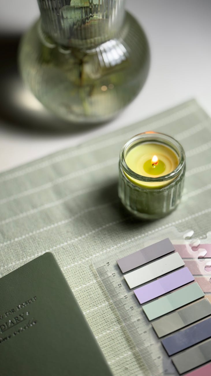
Layering Pastels for Depth and Dimension
A common pitfall when utilizing pastel color schemes is the risk of visual flatness if the palette remains monochromatic across all elements. To counteract this, we employ a technique of tonal layering. This involves selecting variations within the pastel spectrum—moving from pale blush to muted lavender, or from light sage to dusty teal—to create subtle shifts in visual interest without introducing jarring contrasts.
This nuanced approach allows the eye to perceive depth. A strategically placed accent piece in a slightly deeper tone, such as a dusty mauve velvet pillow against a pale grey wall, provides focal interest while maintaining the overarching serenity of the soft palette. This layered effect ensures that the room feels complex and inviting rather than simply washed out.
Integrating Pastels with Functional Spaces
The principles governing serene design extend beyond mere aesthetics; they influence how we interact with functional areas, such as workspaces or reading nooks. When designing an area dedicated to focused work, incorporating soft tones can significantly reduce background stress. For instance, using a light blue-grey as the primary wall color minimizes the visual fatigue associated with prolonged screen time.
This is directly related to optimizing the surrounding environment. We see this principle apply even to desk setups; arranging items in a calm visual field supports better concentration. Consider how an organized setup contributes to mental clarity. Ergonomic Aesthetic WFH Desk Organization Hacks (https://decorandliving.com/wfh-desk-organization-hacks/) demonstrate that minimizing visual clutter frees up cognitive resources. A soft backdrop enhances this focus by eliminating visual distraction, allowing the user to concentrate on tasks without sensory overload.
Materiality and Texture: The Tactile Experience
The tactile experience is inseparable from the visual perception in cozy home decoration. Softness is not just a color; it is a sensation conveyed through touch. Materials that invite physical interaction reinforce the intended mood of serenity. Natural fibers, such as wool, cotton, and linen, possess a unique ability to absorb sound and soften harsh lines.
When selecting textiles for pastel spaces, we prioritize matte finishes over high-gloss surfaces. A matte finish absorbs light gently, preventing glare and contributing to an overall softer illumination. This tactile interplay between the soft visual palette and the soft physical textures creates a deeply immersive sense of coziness. The way fabric drapes and the way a rug feels underfoot directly contributes to the perceived level of comfort in the space.
Establishing Harmony Through Restraint
Mastering the art of the pastel color scheme ultimately requires restraint. Over-saturation or excessive pattern mixing disrupts the delicate balance established by the soft tones. We observe that true serenity emerges from simplicity and intentionality. The goal is not to fill every surface with color, but to curate a space where every element serves the purpose of creating calm.
This means allowing the pastel hues to breathe. Use them as the foundational layer upon which textures and carefully chosen furniture pieces can be layered. By treating the palette as a gentle canvas rather than an aggressive statement, we allow the inherent tranquility of the soft colors to dictate the room’s atmosphere. This careful calibration is what elevates a simple room into a truly serene sanctuary, achieving that desired feeling of cozy home decoration through thoughtful chromatic design.
Tags: pastel colors, cozy decor, pastel palettes, airy spaces, home decor, color psychology, serene interiors
Featured Image by Tuğba Dönmez on Pexels.