
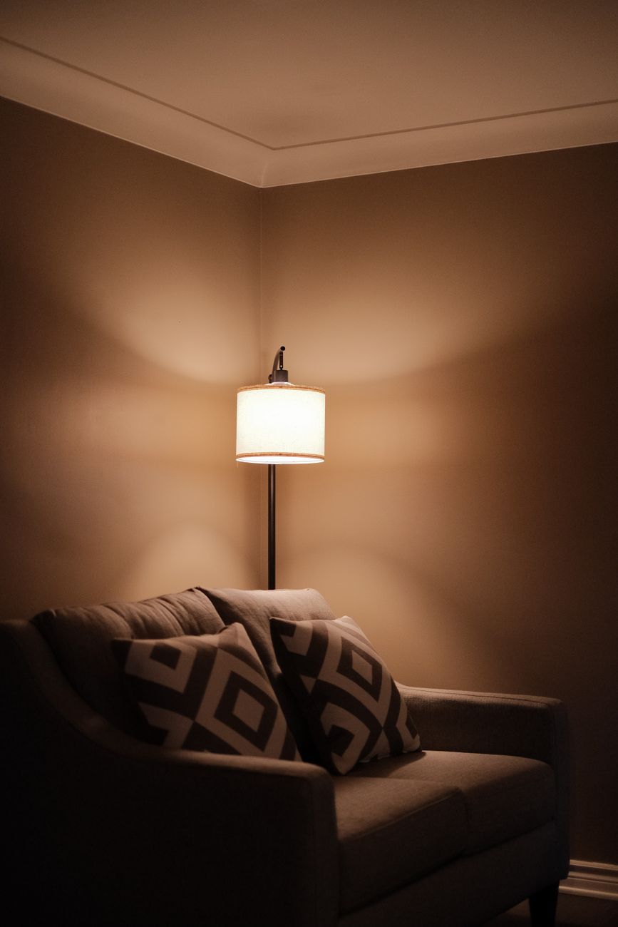
The Science Behind Softness: Engineering Atmosphere with Light Neutrals
We observe a consistent human response to visual stimuli; environments saturated with soft, light neutral tones trigger physiological relaxation. This is not mere aesthetic preference; it involves measurable shifts in circadian rhythms and stress hormone regulation. When we select palettes dominated by whites, creams, soft grays, and pale beiges, we are essentially tuning the visual input to promote a state of calm alertness. The mechanism operates by reducing the visual strain placed upon the ocular system, allowing the brain to downregulate sympathetic nervous system activity.
Creating spaces conducive to coziness requires understanding how light interacts with color saturation. Darker colors absorb more light and create visual weight, which can feel grounding but also imposing in certain contexts. Light neutrals, conversely, maximize ambient light reflection, effectively brightening even smaller physical spaces and minimizing the perceived density of the room. This manipulation of light is foundational to establishing an airy yet deeply comfortable atmosphere.
Deconstructing the Psychology of Light Reflection
The strategic deployment of light neutral color schemes for cozy homes leverages principles of optical physics. Consider the effect of diffuse light. When light bounces evenly across a surface, shadows soften, and harsh contrasts diminish. This diffusion mimics natural, indirect lighting conditions found in environments like overcast days or rooms near large windows. We are intentionally engineering this diffused quality indoors.
Our analysis suggests that high levels of reflective surfaces—achieved through pale wall colors and light-toned flooring—increase the overall luminosity of the space. This increased perceived brightness directly correlates with a feeling of spaciousness, counteracting any potential claustrophobia inherent in enclosed spaces. The effect is subtle but powerful: an environment that feels expansive paradoxically encourages introspection and relaxation.
Texture as the Essential Layering Mechanism
Color alone does not generate coziness; texture provides the necessary tactile anchor for the visual experience. A smooth, flat expanse of pale gray feels cool and sterile without intervention. Introducing varying textiles shifts the interaction between light and matter dramatically. Rougher weaves, chunky knits, and soft velvets introduce micro-shadows that engage the visual system more deeply.
We see this principle applied across various decorative elements. The interplay between matte fabrics and subtly reflective surfaces generates a rich visual depth that flat colors cannot achieve on their own. For instance, juxtaposing a matte linen sofa against a high-pile, creamy rug creates a dynamic textural dialogue. This layering mechanism forces the eye to slow its scan, engaging sensory processing in a deliberate, calming manner.
When considering textiles, the tactile experience is paramount. The sensation of sinking into soft materials signals safety and invitation. We find that employing varied textures across the room prevents the space from feeling monolithic or monotonous. Think about how different fabrics absorb and reflect light differently; this differential interaction creates pockets of visual warmth. For instance, layering luxurious bedding achieves an immediate sense of enveloping comfort by providing multiple zones of tactile softness against the skin.
Selecting Your Light Neutral Palette Strategy
Determining the exact shade within the neutral spectrum dictates the final emotional tone. Not all light neutrals are created equal; their undertones profoundly influence the perceived warmth or coolness of a space. Warm neutrals incorporate subtle yellow, beige, or rosy undertones, which introduce an inherent sense of welcoming warmth even in high-light settings. Cool neutrals lean towards gray with blue or purple undertones, enhancing a crisp, airy, and contemporary feel.
We observe that using overly cool grays in large living areas can result in an atmosphere that feels more clinical than cozy, despite the light reflection. Conversely, embracing warm off-whites—creams and ivory—allows the reflective quality to translate directly into palpable warmth. This choice is about setting the baseline emotional register for the entire environment.
Implementing Light Neutral Color Schemes for Cozy Homes
The practical application of these principles involves systematic material selection throughout the decorating process. Start by establishing a base layer with light neutral paint across all major surfaces. This provides the necessary expansive canvas for the subsequent textural layers to perform their function effectively. Do not overlook the importance of cohesive planning; every element must work in concert to achieve the desired effect.
When furnishing, prioritize pieces that invite interaction and tactile engagement. Selecting seating upholstered in soft materials immediately shifts the room’s functionality from passive viewing to active comfort. This intentional choice anchors the concept of coziness into the physical reality of the space. Furthermore, integrating natural wood tones alongside the pale neutrals introduces organic warmth that complements the soft palette beautifully.
A practical approach involves managing contrast intentionally. Instead of relying on high-contrast patterns for visual interest, use tonal variations within the neutral range to achieve depth. For example, pairing a pale greige wall with slightly deeper taupe textiles creates subtle definition without introducing jarring visual breaks. This technique allows the space to breathe while remaining richly layered.
Designing Retreats: Creating Zones of Deep Comfort
Cozy spaces are not achieved by uniformly applying soft colors; they are engineered by defining intimate zones within the larger environment. We design retreats where sensory input is maximized for relaxation, which often involves focusing on specific areas rather than attempting blanket softness across the entire area. Consider designing a dedicated reading nook. This small space becomes an intentional sanctuary, a place optimized solely for unwinding.
For example, when setting up a cozy reading nook, focus on enveloping the occupant with soft elements—a plush floor cushion, a textured throw, and warm, diffused lighting. The surrounding walls can remain in the light neutral scheme to maintain an airy backdrop, ensuring the retreat feels secluded rather than boxed in. This process moves beyond mere decoration; it becomes environmental psychology applied directly to interior design.
When you are curating these personal sanctuaries, remember that the goal is sensory integration. You are calibrating the visual experience with tactile and atmospheric cues. The soft and airy palettes function as the neutral canvas upon which rich textures and intentional lighting can execute their purpose. This careful calibration yields an atmosphere that feels effortlessly cozy because it respects the body’s inherent need for softness and gentle light.
Tags: neutral colors, cozy decor, light palettes, home design, color psychology, cozy home, interior design
Featured Image by Shan Nir on Pexels.