
The Psychological Mechanics of Deep Jewel Tone Color Schemes
We observe a distinct psychological response when environments are saturated with deep jewel tones. These hues—think emerald green, sapphire blue, and rich plum—are not merely decorative choices; they function as environmental regulators that directly influence mood and perceived spatial volume. The depth inherent in these colors absorbs light differently than lighter palettes, creating an atmosphere that feels enveloping, intimate, and inherently luxurious. Understanding this mechanism is the first step toward intentionally designing a truly cozy space.
The density of color dictates the visual weight of a room. When we introduce saturated, low-value tones, the eye perceives less visual noise, allowing the focal points—furniture, artwork, architectural details—to gain prominence. This reduction in visual activity fosters a sense of sanctuary. Conversely, lighter colors scatter light widely, increasing perceived distance and making large spaces feel airy but potentially impersonal. Deep jewel tone color schemes manipulate this optical effect; they pull the visual field inward, encouraging occupants to settle and engage with the immediate surroundings rather than scanning the periphery.
Analyzing Light Interaction and Perceived Intimacy
The way deep colors interact with ambient light is critical to achieving that sought-after moody coziness. Darker tones inherently reduce the amount of reflected light within a space. This phenomenon creates an internal glow, emphasizing warm light sources like candlelight or warm-toned lamps. We are essentially engineering an atmosphere of intentional shadow play. This interplay between deep color and focused illumination generates high contrast, which registers to the human visual system as depth and richness.
In practice, this means that rooms painted in these tones require careful layering of lighting. Harsh, bright overhead lighting will flatten the effect immediately, stripping away the moody quality. Instead, we must employ layered lighting strategies: dimmers, strategically placed accent lamps, and warm color temperatures (aiming for 2700K or lower). This controlled illumination manipulates shadows, allowing surfaces to reveal their texture rather than being washed out by uniform light.
Establishing Depth Through Color Theory
The principle of atmospheric perspective is leveraged effectively when deploying deep jewel tones. Because dark colors recede visually, they naturally enhance the perception of depth within the room. Imagine a vast expanse of sapphire wall; the eye perceives that distance instantly. This effect works synergistically with architectural features. When paired with rich textures—velvets, dark woods, or heavy drapery—the three-dimensional quality of the space intensifies considerably.
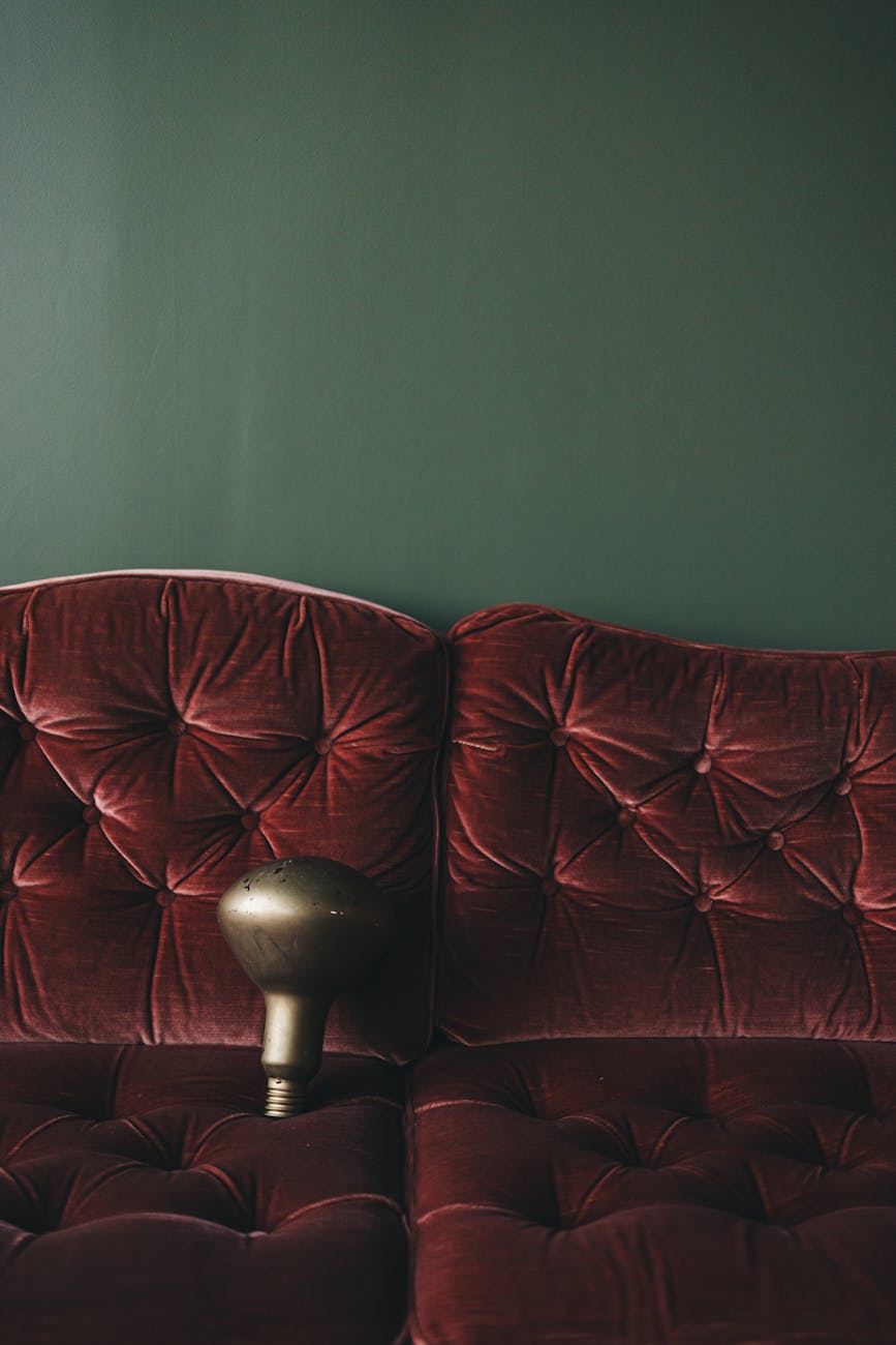
Consider how these tones anchor different zones within a room. A deep emerald accent wall immediately establishes a sense of enclosed luxury. This anchoring effect is powerful because the color acts as a visual magnet, pulling adjacent elements into its gravitational field. We are not just painting walls; we are defining experiential zones. When selecting your palette, analyze the relationships between the colors you choose. Pairing deep blues with warm brass accents creates an immediate sense of regal comfort, whereas mixing highly saturated tones can lead to visual dissonance if the proportions are unbalanced.
Integrating Textural Richness for Tactile Coziness
Color sets the emotional stage; texture provides the physical invitation to stay. A space defined by deep jewel tones requires equally deep textural engagement to realize a truly cozy aesthetic. The juxtaposition of smooth, rich color with tactile surfaces engages multiple sensory receptors simultaneously, deepening the immersive experience.
The materiality of the décor must complement the visual depth established by the color scheme. For instance, pairing a deep plum wall with smooth, cool surfaces creates a sophisticated drama. However, introducing organic, soft elements counters this severity, softening the edges and inviting physical interaction. This contrast between the visual weight of the color and the tactile softness of the fabric is what generates true coziness.
The Role of Soft Textiles in Sensory Comfort
Soft textiles are not just about comfort; they are active participants in defining the room’s ambiance. When you select materials like velvet, heavy linen, or chunky knit wool, you are introducing a physical layer that interacts with light and touch. Velvet, for example, absorbs light in a way that enhances the depth of jewel tones, making the color feel richer and more saturated upon contact.
We see this effect repeatedly when integrating these elements into transitional spaces. For example, incorporating luxurious fabrics in a bathroom setting elevates the entire experience. Think about how soft textiles transform a functional area into a retreat. When designing a spa-like environment, ensuring every surface invites touch is paramount. Exploring options like Soft Textiles for a Cozy Bathroom Vibe demonstrates this principle perfectly; the tactile experience becomes inextricable from the visual mood.
Materiality and Surface Quality
The choice of surface finish also dictates how effectively the deep tones register. Matte finishes absorb light softly, enhancing shadows and lending an organic, lived-in quality to the space. High-gloss surfaces reflect light sharply, which can be overwhelming in a moody scheme unless used very sparingly as intentional focal points. We observe that for coziness, matte textures generally win the battle against starkness.
When considering hard surfaces, introducing natural elements bridges the gap between the manufactured luxury and organic comfort. Incorporating raw wood grain or rough stone accents provides necessary textural friction against the smooth depth of the painted walls. This interplay prevents the room from feeling overly synthetic or cold. For example, integrating Rustic Bathroom Decor: Natural Wood & Stone Accents into a space rich with jewel tones grounds the aesthetic, adding an earthy counterbalance to the high drama of the color palette.
Curating the Deep Jewel Tone Palette: A Practical Approach
Selecting the exact shades within the deep jewel tone spectrum requires moving beyond simple color names and engaging in sophisticated tonal analysis. Not all deep colors function equally across different spatial contexts or light exposures. Our analytical approach demands we consider undertones, saturation levels, and the intended functional role of each hue.
Emerald green, for example, possesses an inherent coolness that pairs beautifully with silver or cool gray metals, reinforcing a feeling of elegant serenity. Sapphire blue leans toward depth and introspection, often harmonizing with warm, burnished bronze finishes to introduce necessary warmth. Plum introduces complexity; its richness is best balanced by deep, earthy textures to prevent the space from becoming overly dramatic or heavy.
Balancing Intensity for Sustainable Coziness
The key challenge in utilizing intense color schemes is managing visual saturation across multiple elements. If every surface screams with deep color, the space risks feeling oppressive rather than luxurious. Therefore, strategic use of tone variation is essential for achieving sustainable coziness. We need to introduce tonal relief through varying levels of saturation and value.
Think about this distribution: one major anchor color (the wall), supporting mid-tones (heavy drapery or large furniture pieces), and deep accents (throw pillows or art). This layering prevents the visual field from becoming a monolithic block of intense color. The intentional introduction of lighter, softer elements—perhaps through sheer fabrics layered over velvet, or incorporating lighter wood tones—serves to modulate the intensity. This modulation allows the eye to rest while still absorbing the luxurious mood created by the deep jewel tone color schemes.
Finalizing the Mood Through Detail
The final calibration of coziness resides in the details that interact with light and touch. Think about how hardware finishes reflect ambient light; choosing aged brass over bright chrome immediately infuses history and warmth into a moody setting. Examine the way textiles drape; heavy, pooling fabrics signal comfort immediately upon entry. These small decisions are where the abstract concept of “cozy” translates into tangible, sensory reality for the inhabitant. We move from simply painting a room to curating an experience that engages sight, shadow, and touch simultaneously. This intentional construction ensures that deep jewel tones deliver not just visual impact, but profound, enveloping comfort.
Tags: Jewel Tones, Moody Decor, Cozy Home, Luxury Interiors, Color Palettes, Emerald Green, Deep Blues
Featured Image by Lisett Kruusimäe on Pexels.