
Unpacking the Psychology of Moody Color Schemes for Enveloped Spaces
We observe a distinct psychological response when we intentionally introduce deep, saturated tones into interior design. Moving beyond light, airy palettes allows us to manipulate the perceived spatial volume and emotional temperature of a room. Moody color schemes cozy home decor are not merely aesthetic choices; they function as sensory environments that directly influence mood regulation and cognitive processing. Darker shades absorb light differently, creating an immediate sense of enclosure, which facilitates a retreat from external stimuli. This mechanism taps into primal comfort responses, signaling safety and intimacy to the occupant.
The impact is most pronounced in spaces designed for relaxation. When walls are painted in deep charcoal, deep forest greens, or rich navy blues, the visual field contracts subtly. This effect reduces visual clutter, compelling the eye inward toward focal points—a plush sofa, a flickering lamp, or an intricately carved piece of art. We are essentially engineering a psychological cocoon. The resultant atmosphere is one of profound coziness, a deliberate counterpoint to the harshness of the outside world.
The Mechanics of Light Absorption and Perceived Space
The relationship between hue saturation and light interaction dictates how a space feels. Lighter colors scatter light broadly, making spaces feel expansive and airy. Conversely, deep, saturated hues absorb a greater percentage of incident light. This absorption alters the room’s visual dynamics; shadows deepen, textures gain prominence through contrast, and the overall illumination level shifts toward an intimate glow. In practice, this manipulation requires careful consideration of the light sources employed within the space.
Consider how shadow play functions within a moody setting. Deep shadows introduce visual depth, preventing flat surfaces from feeling monotonous. This interplay between light and shadow adds a layer of complexity that engages deeper sensory perception. We are not just decorating walls; we are sculpting the ambient light experience. Understanding this physical mechanism is key to successfully implementing these sophisticated color strategies.
Selecting Depth: Jewel Tones and Earthy Grays
The selection within the moody spectrum involves choosing specific tones based on their inherent emotional resonance. Jewel tones—think deep emerald, sapphire, and amethyst—carry associations of richness, luxury, and mystery. These colors engage the visual system with a sense of depth that feels inherently sophisticated. When applied to cozy home decor, these tones introduce an element of regal warmth.
Earth tones, such as deep terracotta, burnt umber, and rich sienna, ground the space in organic comfort. These hues connect the interior environment to natural elements, fostering a feeling of grounded security. Combining jewel tones with earthy grays creates a masterful balance; the cool depth of the gray prevents the jewel tones from becoming overly intense, while the earth tones inject necessary physical warmth.
Charcoal and deep slate grays serve as exceptional foundational neutrals for these schemes. Unlike stark black, which can feel oppressive, charcoal offers a sophisticated absorption of light. It provides the necessary darkness without introducing an aggressive visual weight. This gray base allows richer accent colors to emerge without overwhelming the visual field. Our analysis suggests that utilizing this tonal gradation effectively maximizes the enveloping atmosphere sought in moody color schemes cozy home decor.
Layering Textures for Ultimate Cozy Living Room Textiles
The psychological effect of a dark palette is amplified exponentially when paired with tactile materials. A visually deep room requires textural richness to prevent it from feeling flat or cold. This is where layering textures becomes a critical intervention. Introducing velvet, chunky knits, brushed wool, and heavy linen directly addresses the sensory deficit created by light absorption.
When you layer textiles, you are creating micro-environments within the larger space. A heavy velvet throw draped over a worn leather sofa immediately signals luxurious tactile comfort. The visual depth of the color scheme interacts with the physical depth of the fabric pile. This synergy transforms a visually moody room into an enveloping sanctuary. We see this effect repeatedly when people focus on Layering Textures for Ultimate Cozy Living Room Textiles, realizing that the sensory experience is multi-dimensional.
Illuminating the Atmosphere: The Role of Intentional Lighting
A dark color palette demands intentional management of illumination. Poor lighting in a moody setting results in a cave-like gloom rather than an enchanting ambiance. The mechanism here relies on controlling light temperature and intensity to mimic the effect of firelight or candlelight. We must move away from harsh, overhead fluorescent lighting entirely.
The quality of the light source fundamentally alters how the color palette is perceived. Warm-toned light, typically below 3000 Kelvin, enhances the inherent warmth in deep reds, oranges, and browns, deepening their saturation. Conversely, cooler, brighter light tends to drain the richness from jewel tones, making them appear sterile. Therefore, the strategy shifts toward integrating strategically placed, warm light sources.
Beginner’s Guide to Cozy Lighting: Warmth, Brightness & Ambiance provides the framework for this adjustment. Use dimmers on every fixture. Employ strategically placed lamps with warm-toned bulbs. Consider accent lighting that highlights specific textural elements rather than flooding the entire area. This targeted illumination allows the shadows to remain rich and mysterious while ensuring functional visibility. The contrast between the brightly lit focal points and the surrounding deep shadows is what generates the desired dramatic, cozy effect.
Integrating Mystical Elements for Deeper Immersion
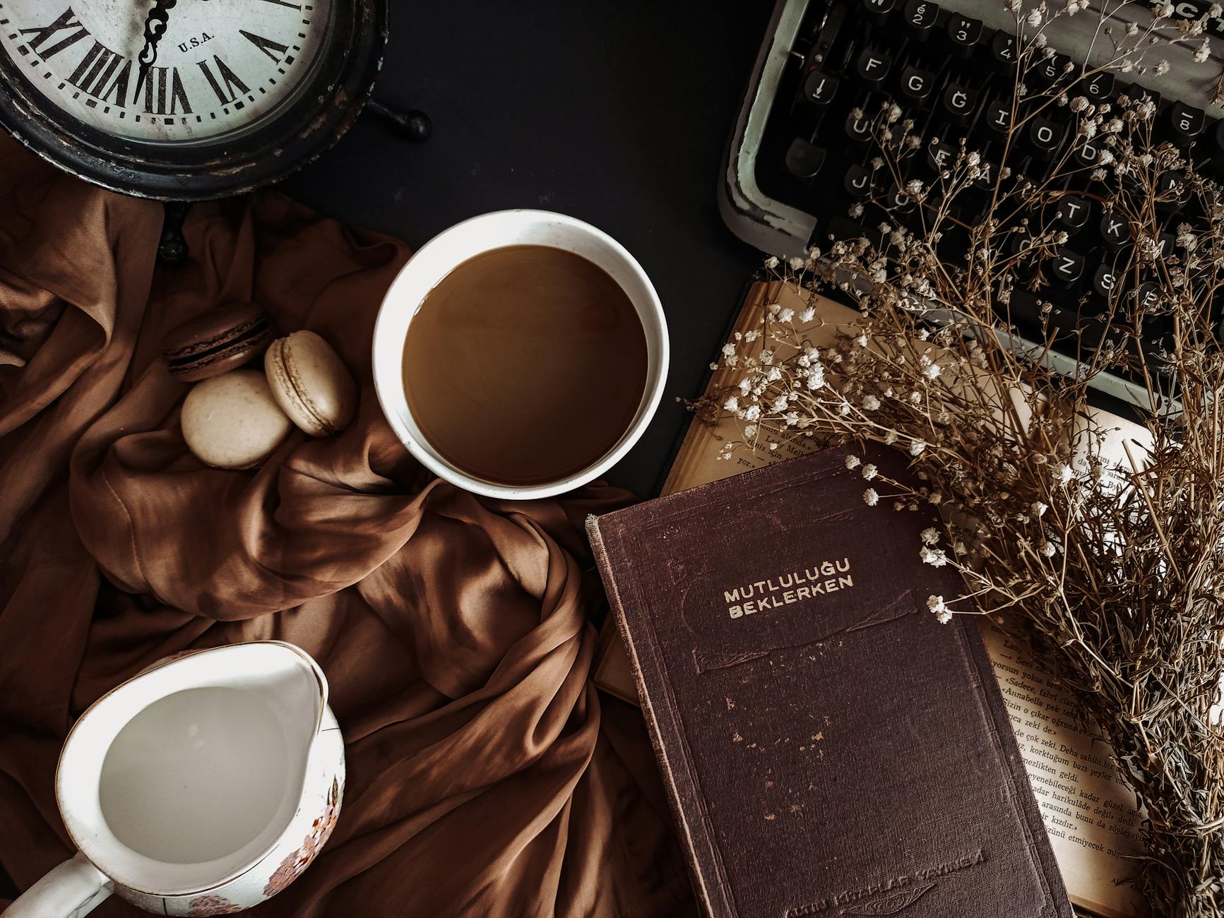
To achieve a truly mystical quality within your moody scheme, integrate elements that evoke enchantment rather than mere darkness. This involves focusing on textures, artifacts, and curated objects that suggest history or fantasy. Think about incorporating aged metals, deep-toned wood, velvet drapery, and antique-inspired decor. These tangible objects act as anchors for the emotional atmosphere we have established with the color choices.
The visual journey in a moody room is enhanced by carefully selected focal points. A dimly lit corner featuring an ornate mirror or an antique lantern draws the eye deeper into the space. This intentional placement directs the viewer’s focus, transforming passive viewing into active exploration. We are designing scenes, not just rooms. Our research indicates that these curated elements bridge the gap between interior design and immersive storytelling.
The combination of deep, enveloping colors, rich tactile surfaces, and carefully calibrated, warm lighting creates a cohesive system. The resulting environment is one where the sense of cozy home decor transitions from simple comfort to an almost magical state. It requires intentional layering across all sensory inputs for the experience to fully materialize.
Tags: moody decor, color palettes, cozy home decor, dark academia, jewel tones, interior design, mystical vibes
Featured Image by hello aesthe on Pexels.