
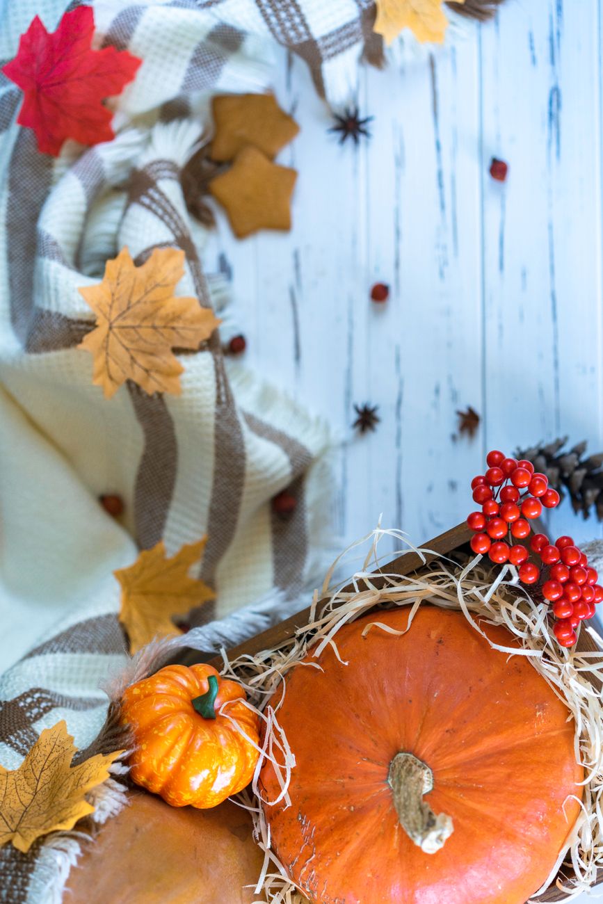
Deconstructing the Palette: The Science Behind Autumn Home Decor Trends
We observe a distinct psychological response when visual environments shift to autumnal tones. This is not merely aesthetic preference; it involves tapping into deep-seated human associations with nature, harvest cycles, and seasonal transition. When designing for **Autumn home decor**, we are manipulating sensory input to elicit feelings of warmth, nostalgia, and grounded security. The specific color families—deep crimsons, burnt oranges, rich golds, and earthy browns—function by activating primal cognitive pathways associated with warmth derived from firelight and the bounty of the harvest.
The transition from the bright, high-energy colors of summer to the muted, saturated tones of fall necessitates a recalibration of interior space. Our analysis suggests that incorporating these specific hues functions as an environmental anchor, mitigating the perceived psychological chill associated with shorter daylight hours. This effect is amplified when textures and materials are introduced; the visual warmth must be supported by tactile comfort. We are not just decorating surfaces; we are engineering an atmosphere where occupants feel enveloped by the season.
The Mechanism of Color Psychology in Fall Decor
The selection of pumpkin, maple, and berry tones provides a specific chromatic strategy for seasonal decorating. Pumpkin orange and deep amber, for instance, carry connotations of ripeness and warmth generated by seasonal abundance. Maple tones introduce complex, variegated browns and reds that mimic fallen leaves, linking the interior space directly to the exterior landscape. Berry accents—deep burgundy, cranberry, and muted violet—provide necessary depth and a sophisticated counterpoint, preventing the palette from becoming overly simplistic or juvenile.
We see this interplay in practice when considering material selection. A room saturated with these hues demands materials that reflect light softly rather than harshly. Matte finishes absorb ambient light, enhancing the sense of coziness. Conversely, introducing textiles woven with rich, deep colors amplifies the effect exponentially. Consider how a velvet throw or a heavy wool blanket interacts with the low, golden light of an autumn afternoon; the resulting visual texture creates an immediate sense of tactile luxury that directly feeds the cozy aesthetic we aim to achieve.
Integrating Natural Motifs: From Foliage to Furnishings
The thematic elements of autumn—leaves, gourds, and berries—must be translated into tangible design components. Simply scattering a few artificial leaves across a surface results in visual noise. Effective integration requires strategic placement and layering. We need to establish focal points where these motifs exert their maximum influence without overwhelming the space.
For example, utilizing large-scale art featuring abstract interpretations of fall foliage provides an expansive backdrop. This allows the rich color palette to breathe while still communicating the seasonal theme effectively. Another approach involves textural layering. Placing woven baskets filled with dried corn husks or richly colored wool blankets introduces organic texture that mirrors the natural world. This technique grounds the design, connecting the interior space to the outdoor environment in a tangible way.
Crafting Intimate Spaces: Designing for Comfort Zones
The goal of cozy decor is to maximize comfort within the architectural constraints of the space. This often means intentionally carving out zones of intimacy where the sensory experience is heightened. We focus on creating intentional nooks rather than simply dressing entire rooms uniformly. When designing spaces for relaxation, the attention shifts to how light interacts with soft furnishings and defined boundaries.
Designing cozy corners for living room comfort involves establishing these intimate zones. A well-defined corner allows a grouping of soft elements—a plush armchair, a side table, and a textural rug—to function as an independent micro-environment. This process requires careful consideration of scale. Large, enveloping textiles work best when they define the perimeter of the space, drawing the viewer inward. We observe that creating these defined spaces encourages occupants to settle in, reducing visual distractions from the broader room environment.
Materiality: The Tactile Layer of Autumnal Decor
The physical experience of autumn decor is intrinsically linked to the materials employed. The choice of fabric dictates the level of perceived coziness far more than the pigment itself. Natural fibers communicate authenticity and warmth. Wool, for instance, possesses a unique thermal and visual quality that traps and radiates heat, creating an immediate sense of physical security.
When selecting textiles for your **Autumn home decor**, examine the weave and the density. Chunky knits offer significant visual weight and tactile appeal, signaling substantial comfort. We see this effect when referencing patterns like DIY Chunky Knit Blanket Patterns: Master Cozy Stitch Designs. These heavy textures absorb light beautifully, deepening the autumn hues woven into them. This materiality moves the design from a flat color scheme to a deeply immersive experience.
Layering Textures for Depth and Richness
A sophisticated autumnal display relies on textural complexity rather than singular pattern repetition. Imagine layering elements: a smooth, matte wooden surface beneath a chunky knit throw, topped with a soft, velvety pillow, and anchored by a richly patterned wool rug. This juxtaposition of textures prevents the space from feeling flat despite the monochromatic color scheme. The interplay between rough, soft, smooth, and plush surfaces creates a dynamic visual interest that engages multiple sensory inputs simultaneously.
This layering strategy allows the pumpkin orange hue to be experienced differently depending on the material touching it. A matte ceramic vase holding deep amber berries feels different than one filled with glossy, polished glass. Understanding this textural hierarchy is key to achieving authentic coziness; it is about providing varied points of tactile engagement for the eye and the hand.
Implementing the Palette Across Surfaces
Applying the pumpkin, maple, and berry scheme requires strategic distribution across all major surface planes. Walls benefit from deeper, moodier tones—think muted terracotta or deep ochre—which provide a rich backdrop against which lighter accents can pop. Furniture anchors this scheme; heavy, dark wood pieces naturally reinforce the earthy foundation of the season.
For accents, we focus on curated objects. Incorporate elements that reflect the themes directly but in a sophisticated manner. Display arrangements featuring dried seed pods, carefully placed branches, and clusters of faux or real berries offer organic focal points. These items function as living anchors for the color story, providing narrative context rather than simple decoration.
Finalizing the Autumn Atmosphere
The successful execution of **Autumn home decor** hinges on intentional curation and sensory alignment. We move beyond mere application of color; we engage in an exercise of atmospheric engineering. By focusing on deep, resonant hues, embracing substantial textures, and designing spaces that invite physical rest, the result is an environment that actively promotes feelings of warmth and welcome. The process involves understanding how light behaves within these new chromatic boundaries and ensuring that every element contributes to a cohesive narrative of harvest comfort. This intentional approach transforms a seasonal update into a deeply personal sanctuary.
Tags: autumn decor, fall color palette, cozy home, pumpkin decor, fall decorating, harvest tones, seasonal style
Featured Image by Atlantic Ambience on Pexels.