
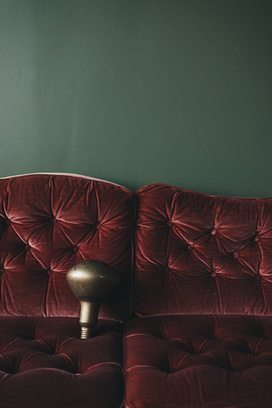
The Psychological Mechanics of Depth in Interior Color
We observe a distinct psychological response when we introduce saturated, deep hues into interior design. These colors do not merely sit on the surface; they actively manipulate the perceived spatial volume and emotional temperature of a room. When selecting **deep jewel tone color schemes**, designers are engaging with established principles of visual perception that govern how the human eye processes light and shadow across surfaces. The inherent density of these shades forces the visual field to recede slightly, creating an immediate sense of enclosure, which is precisely what defines coziness.
This effect stems from the way deep colors absorb ambient light rather than reflecting it broadly. This absorption reduces the overall visual ‘noise’ in a space. Consequently, rooms painted in rich tones feel less visually chaotic and more introspective. We are not just decorating walls; we are engineering an atmosphere through chromatic selection. The interaction between the saturated pigment and the available light source dictates the final mood; indirect lighting plays a crucial role here, deepening the saturation of emerald or sapphire tones to enhance their inherent luminosity.
Deconstructing the Impact of Saturation Levels
The depth of a jewel tone directly correlates with its capacity to generate perceived warmth. Consider the spectral qualities of these pigments. Emerald green, for example, contains blue and yellow undertones that, when intensified by saturation, trigger associations with lush, natural environments—think deep forests or precious gemstones. Conversely, plum tones introduce complex red and blue interactions, lending a sophisticated, velvety depth to any surface they cover. Understanding this relationship allows us to select palettes based on the desired thermal output of the space.
Lighter, more desaturated colors operate on a different perceptual plane. Palettes like those found in Soft & Airy Palettes: Pastel Colors for Serene Spaces manage light dispersion effectively, making spaces feel expansive and open. They increase reflectivity, which can lead to feelings of airiness rather than enveloping warmth. Deep jewel tones reverse this mechanism entirely. They establish boundaries internally, promoting a sense of sanctuary where external stimuli are filtered out, fostering a highly cozy environment.
Establishing Cohesion Through Jewel Tone Combinations
Creating a successful **deep jewel tone color scheme** requires more than simply choosing rich colors; it demands an understanding of how those colors interact across different planes—walls, textiles, and furnishings. The key mechanism here is balancing the intensity of the chosen tones to prevent visual fatigue while maximizing immersive effect. We must avoid overwhelming the eye with too many competing strong colors simultaneously.
Balancing Contrast and Harmony
When deploying deep tones, managing contrast becomes paramount. A scheme relying solely on extremely dark hues can feel oppressive if not anchored correctly. We achieve balance by introducing strategic counterpoints. Pairing a saturated sapphire wall with rich brass accents or deep charcoal textiles provides the necessary grounding. This contrast prevents the space from becoming monolithic; instead, it creates visual interest that engages the viewer’s attention thoughtfully.
We observe that mixing cool and warm jewel tones introduces dynamic complexity. Combining emerald and plum, for instance, creates an effect richer than either color alone, achieving a layered depth reminiscent of velvet drapery or polished gemstones. This interplay generates a sophisticated, layered texture on the visual surface. Think about how these combinations mimic the natural variation found in high-end textiles; the subtle shifts in light across differing saturation levels create organic depth.
Integrating Textures for Tactile Warmth
Color alone establishes mood, but texture delivers the tangible sensation of coziness. When working within a deep jewel tone scheme, the selection of materials must reinforce the visual weight established by the paint color. Smooth, cool surfaces like polished marble juxtaposed against incredibly tactile elements—think chunky knit wools, velvet upholstery, or raw silk drapery—amplifies the feeling of enveloping warmth.
The textural layer acts as an amplifier for the chromatic effect. A smooth, dark wall feels imposing; covering it with a heavily textured, soft material immediately redirects the visual experience toward physical comfort. This integration is crucial when moving from aesthetic choice to functional coziness. Consider how these principles translate into seasonal decorating; for instance, incorporating rich, heavy textiles aligns perfectly with Cozy Autumn Harvest: Fall Textile Trends for Warm Home Decor by emphasizing tactile richness during cooler months.
Practical Application: Layering Jewel Tones in the Modern Dwelling
Applying **deep jewel tone color schemes** effectively involves a strategy of layering depth rather than simple application. We are not aiming for a single flat color; we aim for an immersive chromatic environment where different elements contribute to the overall enveloping effect. This process requires thoughtful consideration of how light interacts with these layered surfaces throughout the day.
Grounding the Space with Anchor Colors
To prevent any room from feeling heavy or dark, it is essential to establish grounding anchors within the design. These anchor colors should be utilized sparingly but deliberately—perhaps in a statement piece of furniture, an accent wall treated with a slightly lighter version of the primary jewel tone, or in substantial floor coverings. This technique allows the depth of the primary tones to provide the moody atmosphere while the anchor colors prevent visual density from becoming oppressive.
The rest of the space can then utilize softer, complementary elements to diffuse the intensity. For example, if emerald is used on the main walls, incorporating touches of muted gold or warm ivory in accessories helps pull the intense color into a more inviting sphere. This calibration ensures that the mood remains luxurious and cozy, avoiding the pitfall of appearing overly somber.
Mastering Lighting for Chromatic Amplification
The mechanism by which deep colors achieve their maximum coziness is profoundly dependent on the lighting conditions employed. Harsh, direct overhead lighting will flatten the depth and make the rich tones appear muddy. Conversely, warm, diffused ambient lighting interacts with the pigment in a specific way, enhancing its saturation and creating shadows that deepen the perceived volume of the space.
We need to engineer the illumination to work with the color scheme. Utilizing dimmer switches is not merely about adjusting brightness; it is about controlling the chromatic narrative. Low-level, warm light causes the deep tones to absorb and reflect light softly, maximizing the enveloping effect. This controlled lighting strategy transforms a simply painted room into an actual sanctuary. It demonstrates how manipulating light allows us to harness the inherent psychological power of **deep jewel tone color schemes** for ultimate home comfort.
Tags: jewel tones, moody decor, cozy home, luxury colors, emerald, sapphire, deep plum
Featured Image by Lisett Kruusimäe on Pexels.