
The Science Behind Warmth: Deconstructing Cozy Color Palettes
We often associate coziness with a specific visual outcome—soft textures, ambient lighting, and plush textiles. However, the foundation of a truly serene and warm interior environment is rooted in the manipulation of light and pigment. Understanding how color theory interacts with human perception allows us to move beyond mere aesthetics toward intentional atmosphere creation. Mastering cozy color palettes involves understanding undertones, saturation levels, and the psychological impact of specific hues on our physiological state.
The goal is not simply to apply a pleasing combination; it is to engineer an emotional response through chromatic selection. We observe from the data that certain color combinations trigger feelings of safety and relaxation, directly impacting stress reduction mechanisms within the brain. This process requires moving past surface-level associations and engaging with the underlying physics of light reflection across surfaces.
Decoding Color Undertones: The Subtle Shift in Warmth
The perceived warmth of a space is heavily dictated by the undertone present in the chosen colors. Not all warm colors operate on the same spectrum; variations exist that shift the entire tonal experience dramatically. For instance, a true terracotta carries a deeper, earthier warmth than a pale apricot, which leans more toward softness. We must analyze the underlying relationship between yellow, red, and orange components to determine the correct chromatic direction for our design scheme.
Consider the impact of warm versus cool undertones. Colors with strong yellow or red bases tend to advance visually, making a space feel energized and inviting, whereas colors dominated by blue or green recede, suggesting distance and coolness. In practice, selecting paint or fabric samples requires testing them against natural light throughout the day. We need to observe how the color shifts under direct sunlight versus indirect lamp light because the perceived warmth changes based on the light source illuminating the surface.
Establishing the Core Palette: Building a Foundation of Serenity
Developing a successful cozy color palette begins by establishing a core grouping, usually involving three primary colors, one neutral base, and strategic accent tones. This structure provides the necessary visual anchors for complex layering. A common mistake in this phase is selecting colors based solely on current trends without assessing their long-term interaction with natural light patterns specific to the room’s orientation.
When establishing warmth, we look at the relationship between analogous colors—those sitting next to each other on the color wheel. Keeping the palette within a restricted range of hues ensures visual harmony and prevents the space from feeling chaotic or jarring. For instance, pairing deep sage greens with creamy off-whites creates an immediate, grounded sense of tranquility that supports relaxation. This method leverages chromatic proximity to induce a cohesive, restful experience.
Integrating Texture: The Tactile Layer of Cozy
Color sets the emotional tone, but texture provides the physical invitation into that atmosphere. A visually cozy space must also feel physically inviting through tactile engagement. Softness is intrinsically linked to perceived comfort; rough surfaces create tension, while soft textiles invite touch and rest. This mechanism works because our sensory system registers physical interaction as a form of safety and familiarity.
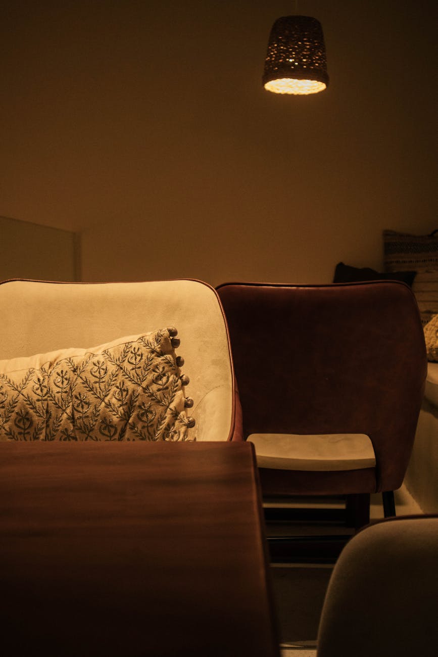
Incorporating varied textures within the chosen color palette amplifies the effect exponentially. Imagine a room painted in muted terracotta tones. Layering this with chunky knit throws, velvet cushions, and linen drapery introduces depth that light cannot achieve alone. This textural juxtaposition prevents the color scheme from becoming flat; it adds necessary visual complexity. For those focusing on adding natural, handcrafted elements to their decor, exploring items like DIY Macrame Wall Hangings: Boho Decor You Can Make (https://decorandliving.com/diy-macrame-wall-hangings/) demonstrates how tactile materials integrate seamlessly into a warm aesthetic by introducing organic texture.
The Role of Light in Color Perception
Light is the ultimate modulator of any color scheme. A beautiful palette can be instantly undermined if the lighting conditions are incorrect. Natural light, particularly indirect, diffused light, reveals the subtle nuances of undertones most accurately. Direct, harsh midday sun can wash out delicate shades, making warm tones appear overly saturated or, conversely, casting cool shadows that introduce an unwanted chill.
To maximize coziness through light manipulation, we must control the source and quality of illumination. Utilizing warm-toned bulbs, typically in the 2700K to 3000K range, shifts the entire visual field toward the amber end of the spectrum, enhancing the inherent warmth of reds, oranges, and yellows present in the chosen colors. This deliberate lighting choice synchronizes the physical environment with the psychological desire for warmth.
Applying Palettes to Specific Spaces
The application of a cozy color palette changes based on the function of the space. A living room demands enveloping warmth, encouraging lounging and conversation, while a bedroom requires deeper, more subdued tones that promote sleep cycles. The principles remain consistent, but the saturation and intensity shift according to the intended activity.
For example, in a home office setting, where focus is paramount, we can still employ cozy elements without sacrificing concentration. We can utilize muted, deep greens or warm grays as the primary backdrop color because these tones offer grounding without introducing excessive visual stimulation. This allows the environment to feel supportive rather than distracting. When designing an ergonomic space that supports both work and relaxation, consider how colors influence focus; perhaps a rich, warm tone on one accent wall can induce calm while the functional workspace maintains a neutral baseline. We analyze how spatial design affects cognitive function; for instance, exploring 5 Ways to Design an Ergonomic Cozy Home Office Nook (https://decorandliving.com/design-ergonomic-cozy-home-office-nook/) shows how strategic color use can balance these competing needs effectively.
Achieving Depth Through Contrast and Layering
A flat application of a cozy palette risks appearing simplistic or overwhelming. True depth emerges when we introduce thoughtful contrast and layering within the scheme. This involves balancing deep, saturated colors with lighter neutrals and mid-tones. The interplay between these values creates visual hierarchy, drawing the eye across the space in an engaging, layered manner.
We achieve this layering by intentionally juxtaposing materials and tones. A dark wood floor provides a rich, cool anchor against which warm, creamy walls can glow, creating dynamic tension that feels rich rather than static. This contrast is the mechanism by which coziness gains its dimensionality; it prevents the room from feeling monolithic and flat. Observe how shadows interact with these contrasting planes; they define the architectural space while simultaneously enhancing the perceived depth of the color scheme.
The final execution involves a methodical process: select undertones, establish the core hues based on light analysis, introduce textural variation, and finally, calibrate the lighting to reinforce the intended emotional state. This systematic approach transforms the abstract concept of “cozy” into a tangible, achievable interior reality for any home environment.
Tags: cozy color palettes, interior design, color theory, warmth in design, home decor, cozy atmosphere, color psychology
Featured Image by Abdullah Gouiaa on Pexels.