
Deconstructing the Science of Warmth: Building Your Cozy Color Palette
Selecting colors for a space is not merely an aesthetic choice; it is a psychological manipulation of the environment, directly influencing mood, perceived temperature, and behavioral patterns. When we approach the task of establishing a cozy color palette, we are engaging with principles of color theory, light interaction, and human perception. We observe from the data that certain wavelengths trigger specific physiological responses, creating an immediate sense of comfort or tension within a space.
The foundation of a successful cozy scheme rests on understanding how hue, saturation, and value interact under ambient lighting conditions. A highly saturated, deep color tends to absorb light, creating a feeling of enclosure and intimacy, whereas lighter, desaturated tones reflect more ambient light, promoting an expansive, airy sensation. We must engineer the visual experience so that the space functions as a retreat.
The Psychology Behind Warmth: Temperature and Hue
Warm colors—reds, oranges, and yellows—naturally stimulate feelings of energy and welcome. These hues mimic the warmth of firelight or sunlight, triggering physiological responses associated with relaxation and sociability. Conversely, cool colors like blues and greens invoke tranquility and calmness. Our analysis suggests that for achieving a cozy atmosphere, we must prioritize warm undertones in our primary selections.
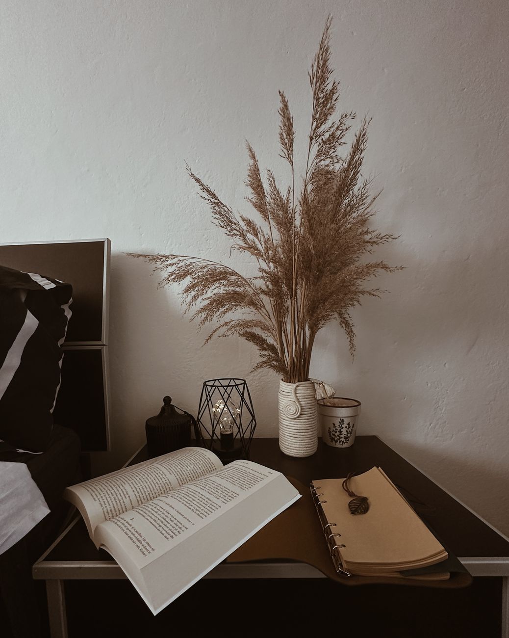
Consider the effect of hue intensity. Deep terracotta or burnt orange offers profound warmth, anchoring a room with a sense of grounded security. Lighter apricot or soft peach introduces a gentler layer of invitation, perfect for spaces intended for rest. The saturation level dictates the visual weight; overly saturated deep tones can feel heavy, demanding attention, while muted, desaturated warm tones achieve a softer, more enveloping effect. We find that mixing these elements—a dominant warm base with strategic cool accents—creates dynamic depth rather than monotony.
Establishing Your Core Palette: Foundational Principles
When initiating the process of selecting your cozy color palette beginner guide, we start by defining the overall emotional temperature you wish to establish. This requires moving beyond simple preference toward intentional design strategy. We look at how different colors interact with the natural light entering a room throughout the day. Morning light tends to emphasize cooler tones, while the warm glow of evening necessitates warmer materials and hues for true coziness.
We recommend establishing three primary color categories: your dominant base, your secondary supporting tones, and your accent shades. The dominant base should account for approximately 60% of the visual space and should carry the strongest emotional weight. If you are aiming for deep coziness, consider rich browns, deep moss greens, or warm charcoal greys as your anchors. These colors provide the necessary psychological depth.
Layering Depth: Supporting Tones and Texture
The supporting tones act to modulate the intensity of the base color, preventing the space from feeling flat. This is where we introduce complexity. Pairing a deep rust base with creamy off-whites or muted beige introduces necessary contrast without introducing visual jarring. Observe how this juxtaposition allows the deep colors to recede slightly while the lighter elements offer necessary breathing room.
Introducing subtle variations in value is crucial for achieving depth. Instead of using stark contrasts, employ tonal shifts. For example, layering a dusty rose wall with creamy linen textiles creates an immediate textural richness that reads as sophisticated and inviting. This technique works beautifully when paired with natural textures; for instance, pairing warm earth tones with woven wool throws enhances the tactile experience significantly. We see this principle applied effectively in areas like bathroom design where soft textures enhance serenity, such as in [Spa Sanctuary: Serene Bathroom Decor with Natural Textures](https://decorandliving.com/spa-bathroom-decor-natural-textures/).
Injecting Life: Accents and Finishing Touches
Accent colors serve to stimulate the visual field without overwhelming the established warmth. These are your pops of vibrancy, carefully selected to complement the main scheme rather than compete with it. Think about what objects or textiles you already own that possess a desirable hue—perhaps a deep teal cushion or a muted mustard throw. Introducing this accent color provides an experiential focal point.
The mechanism at play here is visual rhythm. A well-placed accent draws the eye, providing necessary visual interest while reinforcing the overall cozy narrative. We must ensure these accents maintain the established warmth; avoid introducing jarring, high-frequency colors that pull the atmosphere into a cooler, more energetic space. When styling surfaces, like choosing materials for [Cozy Kitchen Countertops: Styling with Natural Textures](https://decorandliving.com/cozy-kitchen-countertops-natural-textures/), the chosen tones must harmonize with the broader environment to maintain visual continuity.
Practical Application: Materiality and Light Management
Color theory alone is insufficient; the physical materials you employ dictate the actual experience of coziness. The texture and reflectivity of surfaces modulate how light interacts with your chosen palette, fundamentally altering the perceived warmth. Matte finishes absorb light softly, enhancing intimacy. Glossy finishes reflect light sharply, which can feel more energetic. We observe that utilizing matte materials—like linen, wool, or matte ceramics—naturally amplifies the cozy effect, regardless of the specific hue selected.
Light sources must also be integrated into the color strategy. Artificial lighting, particularly incandescent or warm-toned LED bulbs (around 2700K), directly enhances the warmth inherent in orange, red, and gold tones. If your primary palette leans cooler, you must compensate by employing warmer light temperatures to balance the visual temperature of the space. This interaction between pigment and illumination is where theoretical color meets lived experience.
Analyzing Specific Cozy Archetypes
Different styles of coziness demand slightly different spectral approaches. A maximalist cozy space benefits from deep, layered palettes—think jewel tones mixed with rich browns—where saturation levels remain high across all elements. This demands careful management to prevent visual fatigue; the layering must feel intentional, not chaotic.
Conversely, a minimalist cozy aesthetic relies on tonal harmony achieved through restraint and monochromatic shades. Here, the palette leans heavily on variations of cream, beige, taupe, and soft grey, where depth is established entirely through texture variation rather than chromatic contrast. The mechanism shifts from color juxtaposition to textural interplay; the coziness emerges from the tactile quality of the materials themselves.
When applying this understanding to a beginner’s guide to cozy color palette, remember that experimentation is vital. Test samples under your actual room lighting for an extended period. Observe how the colors shift as the sun moves across the day. This empirical observation replaces guesswork with tangible data regarding your specific environment. We move from abstract concepts to concrete results when we treat color selection as a measurable design variable.
Tags: color palette, cozy decor, home design, color theory, interior design, warm colors, beginner guide
Featured Image by Book Hut on Pexels.