
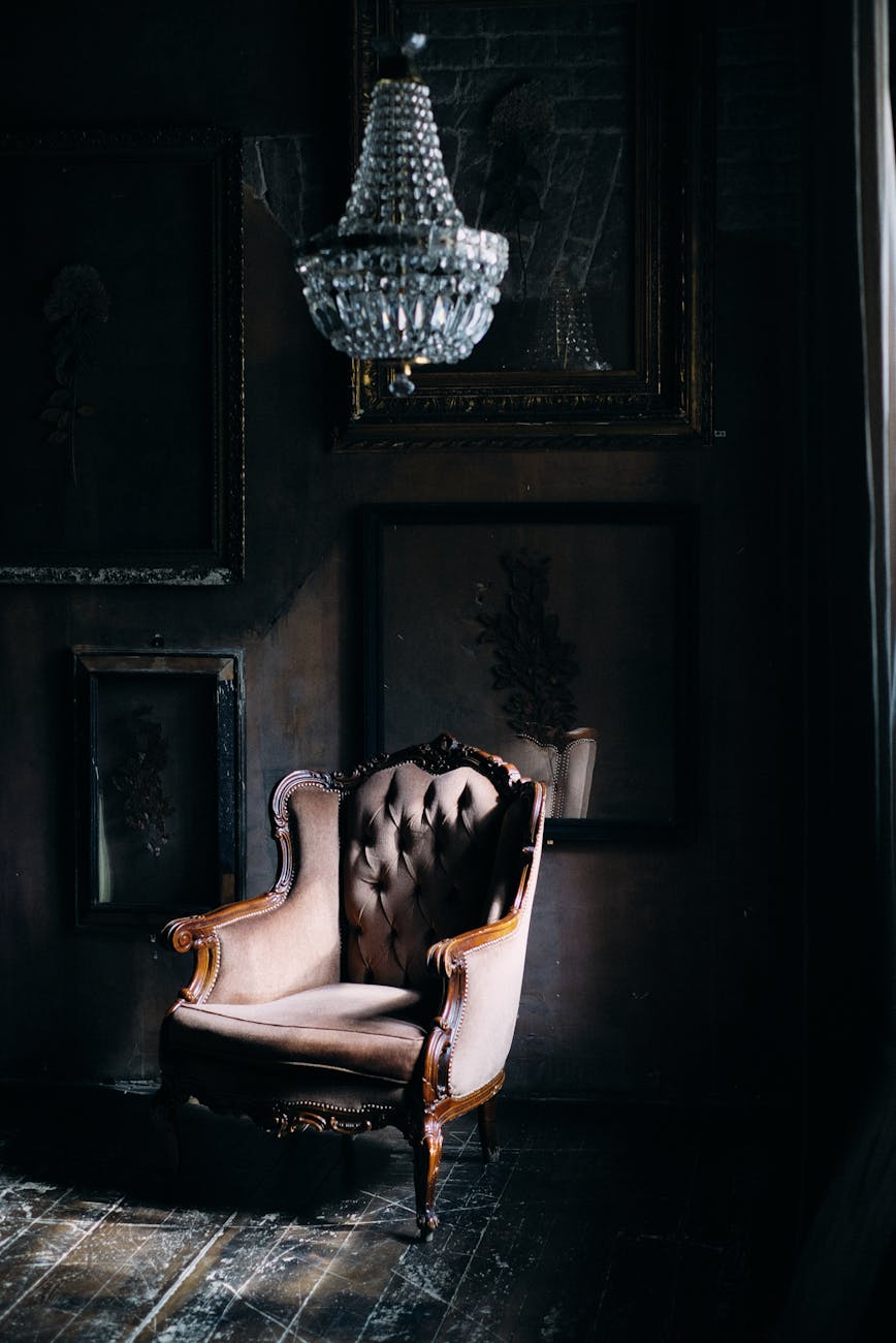
The Psychological Mechanism Behind Deep Moody Color Schemes
We observe a distinct psychological response when manipulating ambient color saturation; deep moody color schemes function by reducing visual stimulation and encouraging introspection. When lighter, high-key palettes dominate a space, the visual field is flooded with expansive light reflection, which can induce alertness and activity. Conversely, incorporating deep tones, such as charcoal, deep navy, or rich forest green, forces the eye to slow its processing speed. This deceleration directly translates into a sense of enclosure and calm within the environment.
This mechanism operates on principles of visual weight. Darker colors possess greater visual density, effectively pulling the perceived boundaries of a room inward. We are not merely decorating walls; we are engineering an atmosphere where sensory input is filtered and curated by the surrounding tones. This process mimics the psychological effect of retreating into a secure, sheltered space, regardless of the actual physical dimensions of the room. The resulting effect is profound intimacy.
How Color Saturation Influences Perceived Space
The relationship between hue depth and spatial perception is not arbitrary; it involves the manipulation of light interaction. Deep colors absorb more ambient light than lighter shades, which changes how the eye gauges distance and volume. In practice, this absorption creates shadows that deepen naturally within the architectural features of a room. These inherent shadows enhance textural depth, making surfaces feel richer and more tactile. We see a tangible difference in how a room feels when enveloped in deep tones versus airy pastels; the former suggests shelter, the latter suggests openness.
Consider the effect on reflective surfaces. Darker paint absorbs light, reducing glare and mitigating the harshness of direct illumination. This reduction in reflective intensity lowers the overall visual energy level of the space. When this principle is applied consistently across walls, textiles, and furnishings, the entire environment settles into a state of low-arousal comfort. This is precisely how deep moody color schemes facilitate the sense of enveloping warmth we seek in cozy design.
Selecting Your Palette: Mastering Depth and Tone
Choosing the right depth within a moody scheme requires an understanding of complementary contrasts and material interplay. A successful application relies on layering, not simply painting every surface black or dark gray. We need to identify anchor points that provide necessary contrast while allowing the deeper tones to recede gracefully. Our analysis suggests that introducing metallic accents or warm wood tones serves as critical counterpoints to prevent the space from feeling oppressive or cave-like.
The Role of Contrast in Moody Interiors
Contrast is the engine driving visual interest, even within a monochromatic framework. If every element shares the same low value, the space risks becoming visually flat or heavy. To counteract this, we introduce elements with high contrast. Think about pairing rich navy walls with crisp white trim; this sharp delineation prevents the space from dissolving into undifferentiated shadow. This technique defines architectural lines and adds necessary visual ‘lift’.
We utilize texture to amplify this effect. Rough linen throws, chunky knit blankets, and velvet upholstery interact beautifully with deep colors by introducing tactile variation. These varied surfaces catch light differently, creating dynamic shifts between deep shadows and soft highlights across the room. This textural interplay prevents the deep tones from becoming monolithic; instead, they become rich and inviting.
Integrating Warmth: The Essential Balancing Act
The primary challenge when employing deep moody color schemes is managing the risk of coldness. Without careful calibration, a space dominated by navy and charcoal can feel sterile or unwelcoming. Therefore, introducing warm elements becomes an analytical necessity for achieving true coziness. We must actively inject warmth through material selection and supplementary color choices.
For instance, incorporating aged brass fixtures or rich walnut wood tones introduces organic warmth that counteracts the coolness of the deep pigments. This juxtaposition signals comfort and history, anchoring the space in human-scale experience rather than stark geometry. When designing a retreat, one might focus on creating sensory anchors; for example, ensuring the bathroom functions as a true sanctuary by pairing dark tile with soft, warm lighting, echoing the principles found in spaces like the [Spa Sanctuary: Luxury Bathroom Retreat with Stone & Botanicals](https://decorandliving.com/luxury-bathroom-spa-retreat/).
Texture and Materiality: Building Sensory Richness
The tactile experience of a space is as crucial as its visual impact, especially when employing deep color palettes. Deep moody schemes thrive when surfaces engage the sense of touch. The density of the color demands corresponding richness in the materials used to occupy that volume. We shift the focus from merely seeing the color to experiencing the material reality of the space.
Layering Textiles for Ultimate Envelopment
Textiles are perhaps the most direct pathway to achieving enveloping warmth. Heavy, densely woven fabrics absorb light softly and provide a physical sense of security against the external world. Thick wool rugs layered over hardwood floors immediately increase perceived floor-level coziness. We observe that layering soft materials creates distinct zones of comfort within a larger visual field.
A heavy velvet drape over a window, for instance, diffuses incoming light into a rich, velvety glow. This effect is amplified when the fabric possesses high pile density; this physical depth translates directly into visual softness. When establishing an atmosphere reminiscent of [The Art of Hygge: Simple Ways to Create Cozy Home Vibes](https://decorandliving.com/art-hygge-cozy-home-vibes/), textiles become the primary mediators between the interior and exterior environment. We are creating a deliberate barrier against the outside world, fostering an internal sanctuary.
Furniture as Anchors of Comfort
Furniture selection must align with the scheme’s intent. Large, overstuffed sofas upholstered in deep charcoal or sapphire velvet serve not just as seating but as monumental anchors for the visual weight of the room. These pieces invite physical interaction; one naturally sinks into them, reinforcing the feeling of settled ease. Sleek, minimalist furniture can work, provided it is balanced by textural accessories. The goal is to ensure that every substantial object contributes to the feeling of being completely enveloped and secure.
Practical Application: Executing the Deep Moody Vision
Translating these principles into a functional living space requires a strategic approach to lighting and accessorizing. A dark room demands thoughtful illumination; insufficient light will exacerbate the heavy feeling, turning cozy into claustrophobic. Effective mood setting relies heavily on strategic layering of light sources.
Mastering Illumination for Mood Setting
Artificial lighting must be warm-toned and layered. Relying solely on harsh overhead lighting fractures the desired intimacy. Instead, implement dimmable fixtures and introduce ambient light sources at various heights. Table lamps casting pools of warm, focused light create intimate vignettes on surfaces, drawing attention to textures and creating pockets of intense warmth. This technique allows the deep colors to recede into comfortable shadows while highlighting focal points with inviting luminescence.
The color temperature itself plays a role here; utilizing bulbs in the 2700K to 3000K range ensures that the light quality mirrors the warm tones introduced by the décor materials. This calibration prevents the moody effect from tipping over into a somber or cold presentation.
Finalizing the Scheme with Intentional Accents
The final step involves integrating decorative objects that reinforce the narrative of depth and richness. Objects should possess inherent weight and rich material qualities. Avoid overly bright, glossy plastics; opt for matte ceramics, aged metals, and woven baskets. These items function as visual punctuation marks, adding complexity without disrupting the overarching sense of enveloping calm established by the base color scheme. Every piece selected must contribute to the overall sensory experience—a space that feels deeply personal, richly textured, and profoundly cozy.
Tags: moody colors, cozy decor, jewel tones, dark academia, interior design, rich colors, cozy home
Featured Image by ZUMRAD NORMATOVA on Pexels.