
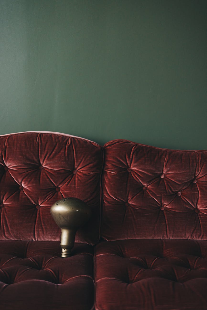
The Psychological Impact of Deep Jewel Tone Color Schemes
When we select a palette for our living spaces, we are not merely choosing surface colors; we are engineering an atmospheric experience. Deep jewel tone color schemes operate on a specific psychological mechanism that directly influences perceived spatial volume and emotional resonance within the interior environment. We observe from the data that saturated, rich hues function by absorbing ambient light differently than lighter tones, creating an immediate sense of enclosure, which is precisely what contributes to dramatic coziness. This effect is rooted in the way color saturation interacts with visual perception; deeper pigments necessitate more visual focus, causing the eye to settle into a state of deep engagement rather than superficial scanning.
This intentional narrowing of visual field creates an enveloping quality. Imagine stepping into a room bathed in deep sapphire or rich emerald. The visual energy is pulled inward, mitigating the expansive feeling that lighter, airy palettes often induce. This effect is amplified when the surrounding textures—velvet, aged brass, heavy drapery—are introduced. These textural elements physically anchor the visual experience, reinforcing the psychological sensation of secure warmth.
Deconstructing the Visual Weight of Saturated Hues
The mechanism at play here involves chroma and value. Deep jewel tones possess a low value (darkness) combined with high saturation. This combination results in colors that register as heavy and substantial on the visual plane. This physical weight translates into an emotional feeling of groundedness. In practice, this density prevents the space from feeling ephemeral or light, lending it an undeniable sense of permanence.
We see this effect consistently across various applications. A deep amethyst wall, for instance, does not simply reflect light; it actively manipulates the light entering the room, casting shadows that define architectural features with greater depth and drama. This manipulation is essential for achieving the dramatic quality sought in cozy interiors. It moves the space from being merely decorated to being deeply inhabited.
Strategic Application: Layering for Maximal Coziness
Achieving true coziness through jewel tones requires strategic layering, not just applying a single deep color. The success of the scheme depends entirely on how these tones interact with reflective surfaces and complementary materials. We must consider the interplay between the wall color, the furniture upholstery, and the metallic accents.
Consider the texture interaction. A matte finish in a deep teal absorbs light softly, enhancing the enveloping effect. Conversely, introducing highly reflective elements, such as polished brass or mercury glass, allows specific points of light to catch the surface, providing necessary visual relief without disrupting the overall sense of depth. This juxtaposition prevents the space from becoming overly somber; it introduces necessary dynamism.
When designing a sanctuary space, this layering process becomes crucial. For example, pairing deep emerald velvet seating with warm, aged wood tones creates a tactile and visual dialogue that immediately signals comfort. We are manipulating sensory input: sight registers depth, touch registers softness, and the overall effect is an immediate sense of retreat. This principle extends to creating personal havens, much like the intentional sanctuary found in a luxury bathroom retreat where stone and botanicals provide a grounding experience.
Integrating Jewel Tones with Textural Narratives
The visual power of jewel tones becomes exponentially more potent when integrated with rich textiles. Color provides the mood; texture provides the tactile invitation to stay within that mood. We observe that the friction between smooth, deep color fields and soft, abundant textiles is what generates genuine interior coziness.
Textiles introduce necessary softness against the inherent visual weight of the saturated colors. When utilizing jewel tones, prioritize materials with deep pile or rich weave structures. Think about incorporating heavy wool throws, cashmere blankets, or velvet curtains that drape luxuriously across furniture. These fabrics physically soften the hard lines of architectural elements and visually diffuse the intensity of the deep hues.
This relationship is particularly relevant when considering seasonal shifts. As we transition into cooler months, the desire for tactile comfort intensifies. Aligning interior palettes with this need involves selecting materials that promise physical warmth. For instance, pairing a rich sapphire backdrop with thick, woven textiles mimics the feeling of being wrapped in something substantial and protective. We see this principle clearly when considering seasonal textile trends; coziness is inherently tied to sensory experience. Explore how fall textile trends for warm home decor can inform this layering approach by emphasizing heavy knits and deep, earthy textures.
The Role of Light and Shadow Play
The manipulation of light becomes the final layer in achieving dramatic coziness. Deep colors thrive in environments where light sources are managed carefully. Direct, harsh lighting tends to flatten rich tones, reducing their depth into mere shadow. Instead, we employ ambient, indirect lighting—pools of warm, diffused light—to allow the color to breathe and reveal its inherent complexity.
Shadows are not mere absences of light; they are active components of a dramatic interior design. When deep jewel tones are used effectively, shadows become defined architectural lines rather than empty voids. This interplay between illuminated surfaces and shadowed recesses creates an illusion of layered depth and mystery. It is this deliberate use of contrast that elevates the space beyond simple decoration into a deeply immersive experience.
Exploring Specific Jewel Tones for Distinct Atmospheres
Not all jewel tones operate with identical psychological weight or ambient effect; their specific vibrational frequency dictates the resulting atmosphere. Understanding the nuances between emerald, sapphire, and amethyst allows for precise atmospheric calibration in interior design projects.
Emerald green signifies deep nature and restorative tranquility. It connects the interior space to organic growth, invoking a feeling of lush, secluded calm. This tone is excellent for creating spaces that feel deeply rooted and meditative. The mechanism here is the association with natural vitality, which grounds the observer immediately.
Sapphire blue introduces a sense of profound depth and regal serenity. It carries an expansive, cool quality while maintaining immense visual weight. Sapphire tones are ideal when aiming for a sophisticated, enveloping calm, suggesting vastness contained within a luxurious shell. This hue works beautifully to create an air of stately tranquility.
Amethyst, the purple spectrum, introduces a layer of rich, almost mystical warmth. It combines the depth of blue with the intensity of red, fostering a feeling of opulent intimacy and gentle drama. Amethyst excels at creating spaces that feel richly layered and deeply cozy, ideal for evening repose.
Synthesis: Building Your Deep Jewel Tone Scheme
Developing a cohesive scheme requires understanding the primary emotional trajectory of the chosen tones before introducing secondary elements. Start with the desired emotional anchor—is the goal deep rest (sapphire), restorative grounding (emerald), or intimate drama (amethyst)? This initial choice dictates the necessary textural and lighting adjustments that follow.
We must ensure the entire visual ecosystem supports the intended experience. If the aim is enveloping warmth, the textiles must be supremely soft. If the aim is dramatic depth, the interplay of light and shadow must be meticulously managed across all surfaces. The goal is to engineer an environment where the occupant feels simultaneously grounded by deep color and enveloped by luxurious tactile comfort. This intentional process transforms a simple color choice into an active atmospheric design strategy.
Tags: Jewel Tones, Interior Design, Cozy Decor, Color Palettes, Luxury Interiors, Emerald Green, Sapphire Blue
Featured Image by Lisett Kruusimäe on Pexels.