
The Psychological Mechanics of Deep Color in Home Design
We observe a distinct psychological response when we introduce saturated, deep colors into domestic environments. These hues are not merely aesthetic choices; they function as environmental regulators, actively manipulating the occupant’s physiological and emotional state. When designing spaces intended for relaxation and comfort, understanding this mechanism is paramount to achieving true coziness rather than mere visual drama. Deep jewel tones—think rich emerald, sapphire, amethyst, and deep ruby—operate by lowering ambient light reflection and increasing perceived intimacy within a room. This effect stems from the color’s density; darker shades absorb more light, which reduces visual sensory input, allowing the mind to settle into a state of reduced stimulation.
The mechanism works by altering the spatial perception of volume. A dark wall does not recede; it seems to advance, creating an enveloping effect that shrinks the perceived boundaries of the space in a comforting way. This process fosters a sense of sanctuary, moving the interior from the public sphere into a private retreat. We are essentially engineering a sensory cocoon where external stressors are visually filtered out. This intentional manipulation shifts the room’s function from a place of activity to a haven for repose.
Analyzing Light Interaction and Thermal Perception
The way deep colors interact with ambient light dictates the thermal quality of a space. In rooms dominated by lighter, airy tones, light reflects broadly, creating an expansive feeling that can sometimes feel cold or sterile if not balanced correctly. Conversely, when we introduce deep jewel tones, the surface absorbs significant photons, which paradoxically enhances thermal perception. The visual weight of the color signals warmth and groundedness to the viewer’s subconscious. This is a direct correlation between chromatic density and perceived heat.
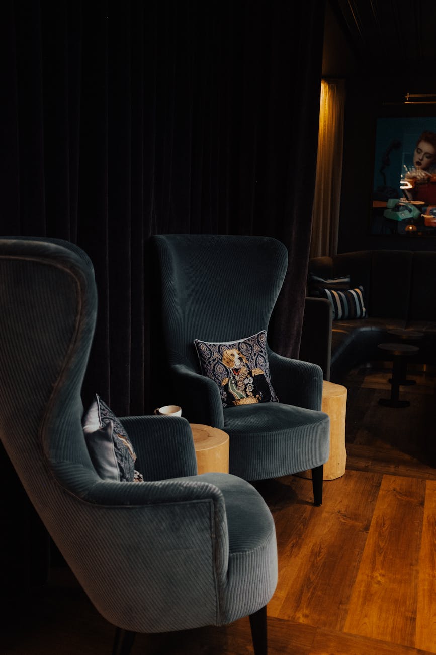
In practice, designers leverage this principle by pairing these rich colors with complementary textures. A deep sapphire velvet sofa, for instance, interacts with light differently than a pale gray linen; the velvet’s pile absorbs light unevenly, creating dynamic shadows that add depth and tactile richness to the visual experience. This layering of visual texture prevents the deep color from feeling oppressive, instead making it feel rich and inviting. We see this principle applied when juxtaposing dark walls with lighter textiles; for example, pairing a deep teal accent wall with furnishings upholstered in soft sage and cream creates an equilibrium where the depth remains intense but is softened by luminous neutrals.
Establishing Depth Through Color Schemes
Creating a successful cozy interior hinges on mastering the interplay between the chosen colors. A haphazard application of dark tones results in visual cacophony, whereas a deliberate deep jewel tone color scheme establishes a cohesive, immersive atmosphere. The key lies in controlling the saturation levels and managing contrast across surfaces.
Mastering Contrast for Visual Depth
Contrast is the tool we employ to define spatial layering. High contrast between deeply saturated elements and lighter, muted areas provides the necessary visual anchor points. Imagine an emerald green feature wall against crisp white trim or light oak flooring. This sharp demarcation prevents the deep color from bleeding into the room, instead framing it as a deliberate focal point.
We must assess the relationship between the dominant colors and any secondary accents. If we select deep burgundy for the main seating area, introducing smaller elements in muted gold or soft cream mitigates the intensity. This technique allows the eye to rest while still registering the overall richness of the scheme. The contrast between the heavy color field and the light-toned textiles—such as those found in Ultimate Cozy Bedding Layers for Every Season—provides necessary visual relief without sacrificing the mood.
Integrating Textures with Chromatic Weight
Color sets the emotional tone, but texture dictates the physical coziness. A flat application of a deep navy blue feels cool; when that same color is rendered in a tactile material like brushed velvet or chunky knit wool, the sensory experience shifts entirely toward warmth and invitation. The visual depth created by the color scheme must be reinforced by tactile depth.
We analyze how different materials absorb and reflect light differently. A matte finish absorbs light, enhancing the moody quality of the deep tones, while a high-sheen finish introduces reflective highlights that add a layer of sophisticated shimmer. When implementing jewel tones, we prioritize surfaces that invite touch; this is where the concept moves beyond mere decoration into genuine interior comfort. Think about how a soft, plush throw draped over an armchair interacts with the surrounding dark walls; the resulting interplay of light and fabric generates immediate sensory engagement.
Practical Application: Implementing Deep Jewel Tones Effectively
Moving from theory to execution requires a systematic approach to managing scale and placement within the physical space. The strategy involves designating color roles: which areas will anchor the mood, and which elements will provide necessary contrast and breathing room.
Zone Definition Through Color Strategy
We segment the space into functional zones, assigning specific color treatments to each area based on its intended function. For instance, the primary living area should embrace the deepest tones, establishing the core mood of enveloping luxury. Secondary areas, such as hallways or ancillary rooms, benefit from slightly desaturated shades that maintain connection without overwhelming the visual field.
The strategic use of lighter neutrals acts as essential visual palate cleansers. When employing intense colors like sapphire or amethyst, integrating large expanses of a gentle neutral, such as Soft Sage & Cream: Your Guide to a Serene Neutral Sanctuary, prevents the space from becoming claustrophobic. These neutrals allow the deep tones to breathe, defining the boundaries of the color story rather than suffocating them. This balancing act ensures that coziness is achieved through richness, not sheer density.
Selecting Complementary Accents
The selection of accent metals and complementary secondary colors must be deliberate; they serve as the supporting architecture for the main color scheme. For deep jewel tones, metallic accents should lean toward antique or warm tones—brushed brass or aged bronze—to reinforce the inherent warmth of the palette. Cool silver tones can introduce an unexpected, stark modernity that disrupts the desired cozy equilibrium.
When selecting accessories, focus on materials that enhance the perceived richness. Incorporating dark wood finishes or rich leather textures grounds the vibrant colors in tangible reality. These elements act as visual anchors, pulling the dynamic color scheme down into a grounded, comfortable state. Our analysis suggests that this anchoring effect is crucial for transforming a bold aesthetic choice into an undeniably cozy environment where every element contributes to the enveloping atmosphere. The entire process is about managing sensory input intentionally, turning complex color theory into tangible, lived-in comfort.
Tags: jewel tones, dark color palettes, cozy decor, dramatic interiors, moody design, color schemes, rich decor
Featured Image by Tasso Mitsarakis on Pexels.