
Deconstructing the Appeal of Sage and Cream
We observe a persistent gravitation toward neutral palettes in interior design, especially within spaces intended for rest and reflection. The sage and cream color scheme represents a sophisticated convergence of organic tranquility and understated elegance. This combination functions not merely as a decorative choice but as a carefully calibrated sensory environment. It manipulates the perception of space, light, and psychological comfort simultaneously. We see this pairing employed across various design philosophies because it mitigates visual noise while amplifying inherent textural richness.
The mechanism at play here involves tonal harmony. Sage, with its muted, cool undertones derived from its green base, introduces an earthy, grounding quality to the composition. Cream, conversely, acts as a luminous reflector, softening the edges and maximizing the perceived light within the space. When juxtaposed correctly, these two tones engage in a dynamic equilibrium that feels both grounded and airy. This interplay allows surfaces to breathe; they are not competing for attention but supporting one another in creating an atmosphere of profound calm.
The Psychological Impact of Muted Neutrals
The selection of sage and cream directly impacts cognitive processing within a domestic setting. Studies consistently indicate that environments rich in muted, desaturated colors reduce physiological stress markers. When visual stimulation is minimized, the brain shifts from an alert, reactive state to a relaxed, reflective state. This effect is particularly pronounced when dealing with high-frequency visual input common in modern life.
The sage tone taps into associations with nature and organic growth, which triggers a primal sense of security. Cream provides the necessary visual respite; it avoids the harshness associated with stark white, offering instead a warm, enveloping glow that prevents the space from feeling sterile or cold. In practice, this effect is amplified when considering material choices. Natural textiles, matte finishes, and untreated wood introduce necessary tactile complexity, further enhancing the sensory experience derived from the color scheme.
Implementing Sage and Cream: A Study in Texture
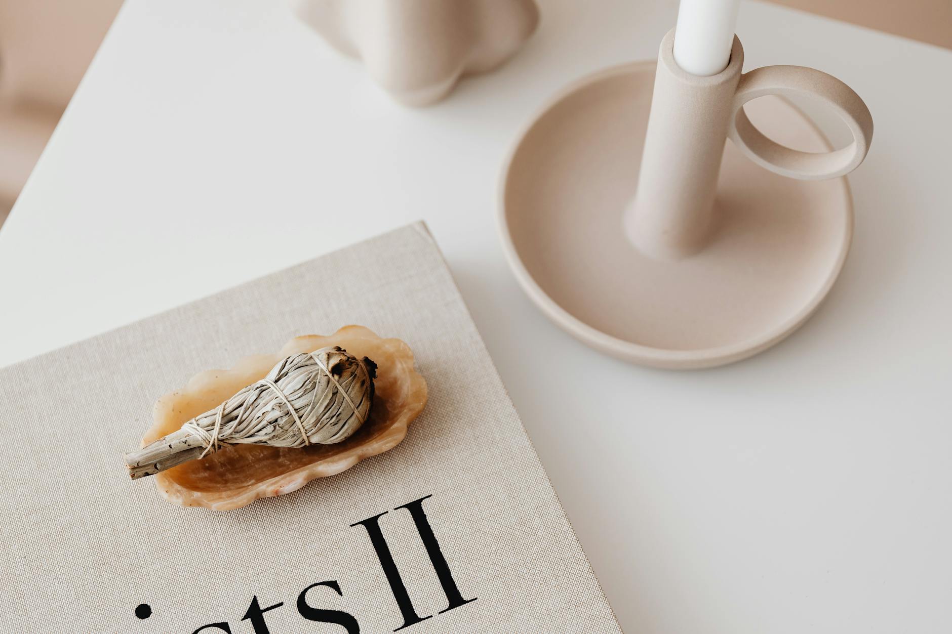
Achieving a truly cozy atmosphere with this palette hinges less on the colors themselves and more on the textural layering applied to those colors. The success of a neutral sanctuary lies in the juxtaposition of soft, tactile materials. We must move beyond simply painting walls; we are engineering an experience through materiality.
Consider the interplay between matte walls painted in a warm cream and furnishings upholstered in linen or bouclé. This contrast forces the eye to engage with surface depth rather than flat planes. The visual texture created by these differing finishes anchors the room, preventing the expansive neutrality from feeling empty. We see this principle applied when setting up focal areas; for instance, creating a cozy reading nook setup benefits immensely from layering soft textiles over a simple backdrop.
Architectural Application: Defining Space Through Color
How we deploy sage and cream across architectural elements dictates the ultimate spatial outcome. Large expanses of wall space benefit significantly from a cohesive application of this scheme. A monolithic treatment in these tones establishes an immediate sense of expansive calm, allowing the furniture and decor to become curated accents rather than overwhelming focal points.
When introducing deeper dimension, we observe how trim, millwork, and accent pieces modulate the overall effect. Painting ceilings a slightly lighter shade of cream can subtly increase the perceived verticality, drawing the eye upward. Conversely, using sage for strategic architectural details—like built-in shelving or interior doors—introduces a deliberate anchor point, preventing the room from dissolving into undifferentiated softness. This technique utilizes color to define zones without resorting to high-contrast boundaries.
Lighting as an Essential Component of the Scheme
Color theory interacts intimately with illumination; light quality fundamentally alters how pigments are perceived. A dull, flat light can mute even the most carefully chosen neutral palette, whereas warm, diffused light allows the cream to glow and the sage to deepen into an inviting, mossy hue. This is why optimizing lighting is non-negotiable in this design strategy.
We find that employing layered lighting systems achieves optimal ambiance. Utilizing warm-toned bulbs, ideally in the 2700K to 3000K range, introduces necessary warmth that complements the cream base. Furthermore, focusing light sources on textural elements—a woven rug, a plush throw—amplifies the tactile richness we established through material selection. A well-lit space feels inherently more welcoming, regardless of the wall color underneath. Consider how this principle applies to creating an environment conducive to relaxation; ensuring adequate, warm illumination supports the transition into unwinding.
Curating Accents: Introducing Organic Depth
The final layer of refinement involves selecting accessories that reinforce the organic and serene narrative established by sage and cream. Avoid introducing jarring, highly saturated patterns or overly glossy finishes. The goal is cumulative effect, where each item contributes to the overall sense of peace.
Introduce natural elements generously. Wood tones, ceramic pottery, and dried botanicals inject necessary earthiness. These elements provide focal points that possess inherent visual interest without demanding excessive cognitive energy from the viewer. When designing for a tranquil space, prioritize items with visible texture and organic form. This deliberate curation transforms the neutral base from merely blank to richly inhabited.
The resulting environment is one where simplicity facilitates peace. The sage and cream color scheme functions as a framework, allowing personal touches—the textiles, the art, the carefully placed books—to provide the unique character of the home. We are not simply decorating walls; we are engineering a state of serene domesticity through calculated use of tone, texture, and light.
Tags: neutral colors, cozy decor, sage green, cream interiors, minimalist design, earthy tones, home inspiration
Featured Image by www.kaboompics.com on Pexels.