
The Psychological Impact of Deep Jewel Tone Color Schemes
We observe a distinct psychological response when utilizing saturated, deep colors in interior design. These are not merely aesthetic choices; they function as environmental regulators that directly modulate mood and perceived space volume. When we introduce hues like emerald, sapphire, or amethyst, we engage with a spectrum that carries inherent associations of richness, depth, and historical gravitas. This effect is rooted in the light absorption and reflection properties of these pigments. Deep tones absorb more light than lighter shades, which paradoxically causes the space to feel immediately more enveloping, fostering a sense of sanctuary away from external stimuli.
The mechanism at play involves visual weight. Darker colors establish a grounding presence; they anchor the eye and slow down visual processing. This slowing effect translates directly into a perception of coziness. Consider the contrast: an overly bright, high-key space demands constant visual attention, whereas a space defined by deep jewel tones invites contemplation and relaxation. We are essentially manipulating the ambient energy of the room through chromatic selection.
Understanding Color Saturation and Emotional Resonance
The intensity of a color directly correlates with its emotional charge. High saturation levels in deep tones trigger feelings associated with luxury and intimacy. Research into color psychology suggests that blue-green families, such as emerald, evoke feelings of tranquility and depth, promoting a state conducive to unwinding. Sapphire, with its intense, cool depth, stimulates a sense of sophisticated calm. Amethyst, leaning toward the violet end of the spectrum, introduces a layer of regal introspection.
This is not accidental; it is an established sensory pathway. When we select these saturated colors for large surfaces—walls, cabinetry, or textiles—we are setting the baseline emotional tone for every interaction within that environment. The visual experience shifts from merely seeing objects to inhabiting a specific atmosphere. We see how this chromatic choice impacts the cognitive load required to navigate the space.
Architectural Implications of Deep Tones
Applying deep jewel tone color schemes requires an understanding of spatial dynamics. In smaller rooms, these colors work by condensing the visual field, making the boundaries feel more intimate and enclosed. This creates a cocoon effect, enhancing the sense of shelter. Conversely, in larger spaces, the depth prevents the room from feeling cold or cavernous; instead, the richness adds necessary ballast. The interaction between the deep color palette and material textures becomes paramount in preventing the space from becoming heavy.
We must manage the balance between visual weight and perceived spaciousness. A room dominated by dark colors benefits immensely from strategic counterpoints. Introducing lighter elements—perhaps through carefully selected textiles or reflective surfaces—prevents the mood from tipping into oppressive shadow. This balancing act requires intentional design layering.
Integrating Textures to Amplify Coziness
Color establishes the emotional foundation, but texture provides the physical, tactile layer that actualizes the cozy experience. A deep jewel tone on a flat surface can feel dramatic; when layered with rich textiles, it transforms into tangible comfort. This integration is where the concept of coziness moves from abstract feeling to concrete sensory input.
Layering textiles for cozy living rooms is not just about adding softness; it is about manipulating how light interacts with the surfaces and engaging different tactile receptors. Think about the interplay between matte velvet, soft cashmere, or richly woven wool. These materials absorb light differently than smooth synthetics. They create micro-shadows that add depth and visual complexity to the deep color base.
The Mechanics of Tactile Experience
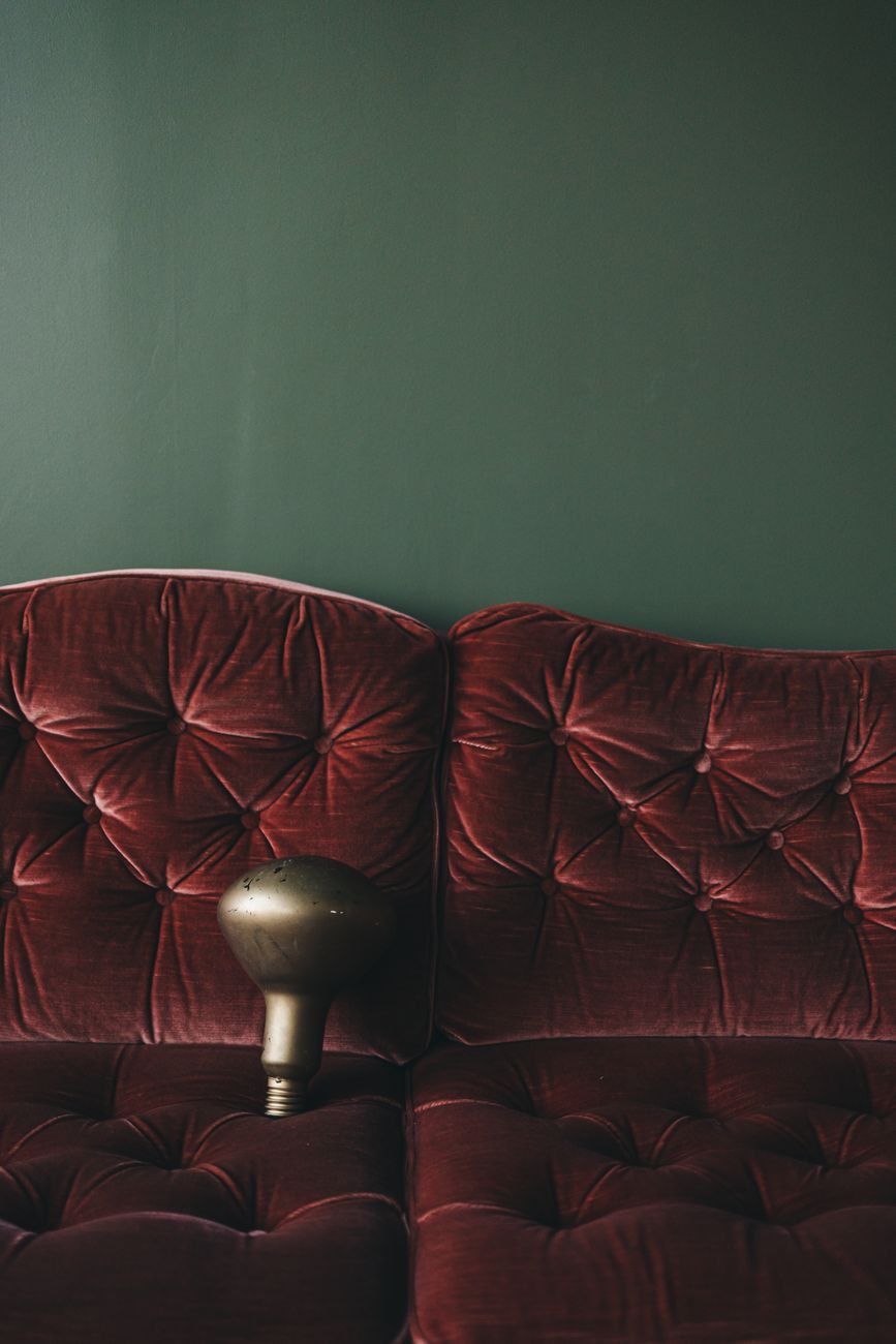
The sensation of coziness is intrinsically linked to touch. When we select fabrics for a space featuring deep jewel tones, we are engaging the sense of touch directly. A heavy, densely woven tapestry against an emerald wall communicates permanence and warmth. A smooth, cool silk draped over a sapphire sofa offers a sophisticated counterpoint to the room’s inherent drama. The difference lies in the materiality.
We observe that textural contrast amplifies the perceived richness of the color scheme. If every surface is flat and uniform, the deep tone can feel monolithic or heavy. Introducing varied textures—the soft nap of a Moroccan rug beneath cool marble, or the chunky knit of a throw draped over velvet seating—injects necessary visual friction. This friction stimulates the viewer’s engagement, making the space feel lived-in and inviting rather than merely decorated.
Materiality in Contrast: Wood and Depth
The selection of complementary materials further refines this sensory layering. The interplay between deep color and natural wood tones creates a sophisticated dichotomy. For instance, pairing rich amethyst walls with warm, deep walnut wood accents introduces an organic counterweight to the cool intensity of the purple hue. This juxtaposition grounds the dramatic color scheme in something tangible and earthy.
When considering furnishings, the material choice dictates the final cozy quotient. Utilizing materials like rustic farmhouse wood accents provides a necessary warmth and familiarity that balances the formality inherent in jewel tones. The grain and texture of aged wood introduce history and tactile depth that complements the enveloping atmosphere created by the deep color palette. This pairing prevents the space from feeling overly opulent or cold; it grounds the luxury in approachability.
Specific Jewel Tones and Their Design Applications
Different jewel tones dictate different atmospheric outcomes. Understanding these specific applications allows for precise design execution rather than generalized application. We must move beyond simply choosing a color and instead focus on its functional role within the room’s narrative.
Emerald: The Depth of Verdant Luxury
Emerald green, with its blend of blue and green, carries an association with nature’s deepest, most precious gems. When deployed as a dominant hue, it establishes an atmosphere of profound, tranquil luxury. This tone pairs exceptionally well with metallic accents—brushed gold or antique bronze—which reflect the light and enhance the richness of the green. In practice, this works best when balanced by natural textures; consider pairing emerald walls with woven jute rugs and velvet upholstery to harness both the cool depth and tangible warmth simultaneously.
Sapphire: The Cool Sophistication
Sapphire offers a cooler, more intellectual dimension than emerald. It evokes a sense of cool, profound stillness. This color scheme thrives when integrated with silver or cool-toned metals. For creating an intensely cozy yet sophisticated environment, sapphire demands textural softness. Imagine deep sapphire velvet seating juxtaposed against creamy, heavy wool throws; this combination leverages the coolness of the tone while ensuring physical comfort.
Amethyst: The Warm Introspection
Amethyst introduces a warmer, more introspective quality to the scheme. It leans into rich, warm shadows and intimate settings. This hue works beautifully when balanced by warm wood tones, such as cherry or mahogany. When designing spaces in amethyst, the focus shifts toward creating an enveloping, contemplative retreat. Layering textiles with heavy, ribbed knits enhances this feeling of cozy enclosure, inviting prolonged rest within the space.
The success of any deep jewel tone scheme hinges on managing these dual forces: the visual weight of the color and the tactile reality of the materials. We are designing immersive sensory experiences. The goal is to harness the dramatic impact of the deep tones while ensuring that every surface invites a physical, restful engagement. This intentional orchestration results in spaces that feel not just beautiful, but profoundly cozy.
Tags: jewel tones, moody decor, luxury interiors, dark color palettes, cozy home, color schemes, dramatic design
Featured Image by Lisett Kruusimäe on Pexels.