
The Psychology of Depth: How Deep Jewel Tones Architect Cozy Luxury
We observe a consistent pattern when we examine interior design choices: the psychological impact of color saturation directly correlates with perceived mood and spatial depth. Moving beyond simple aesthetic preference, engaging with **deep jewel tone color schemes** is an exercise in environmental psychology. These saturated hues do not merely occupy visual space; they actively manipulate the viewer’s physiological state, inducing a sense of richness and enveloping warmth that translates into profound coziness. We are not simply decorating walls; we are engineering an emotional response within the living environment.
The mechanism at play involves light absorption and reflection. Deep colors, such as sapphire, emerald, and amethyst, possess greater visual weight because they absorb more light than lighter tones. This absorption creates an intimate visual field, drawing the eye inward and establishing a sense of enclosure. In practice, when we introduce these saturated pigments into a space, we are effectively reducing visual clutter by unifying disparate elements under a single, rich chromatic umbrella. This process fosters a meditative quality, which is essential for achieving that coveted luxury feel.
Deconstructing the Visual Weight of Rich Hues
The intensity of a color dictates its perceived thermal quality. Darker shades inherently register as warmer than lighter ones when viewed in a confined space. Think about how deep burgundy or forest green interacts with ambient light; they generate an enveloping effect, mimicking the comforting density of natural elements found in deep woods or rich fabrics. This is why these tones function so effectively in creating sanctuaries rather than simply rooms.
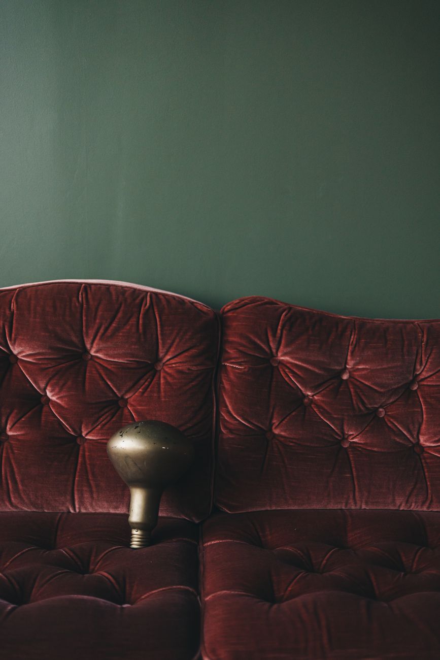
When designing with **deep jewel tone color schemes**, the interplay between matte and reflective surfaces becomes critical to maximizing this effect. A highly polished, glossy finish can introduce an overly clinical sharpness that disrupts the desired coziness. Conversely, pairing velvet textiles, brushed brass accents, and dark wood grains allows the inherent depth of the color to be amplified by textural contrast. This juxtaposition is where true luxury manifests—it is the tension between rich saturation and tactile softness.
Establishing Spatial Hierarchy Through Color
A successful application of deep tones requires a strategic understanding of how they define spatial hierarchies. Dark colors naturally recede, creating an illusion of depth that makes large rooms feel more intimate, even when the physical dimensions remain unchanged. We leverage this recession to establish focal points intentionally. Imagine painting an accent wall in a muted teal or deep navy; this technique anchors the room, allowing lighter elements—like pale rugs or sheer drapery—to float above it, enhancing the feeling of layered space.
This layering effect is crucial for coziness. It prevents the heavy colors from feeling oppressive by balancing them with lighter visual planes. Consider the strategic use of these tones in conjunction with textiles. A heavy, dark wall benefits immensely when juxtaposed against soft furnishings that invite touch. This intentional contrast moves the design beyond mere color application into tangible sensory experience.
Integrating Texture for Tactile Comfort
Color sets the emotional baseline, but texture executes the physical comfort. If we select a **deep jewel tone color scheme**, the subsequent material choices must reinforce the tactile promise of luxury. We must incorporate materials that invite interaction; think about the nap of a velvet sofa, the uneven grain of reclaimed wood, or the soft pile of a thick wool rug. These surfaces catch light in complex ways, introducing subtle shifts in shadow and warmth across the surface.
When we examine how these textures interact with deep colors, we see how the visual depth translates into physical comfort. A dark emerald velvet absorbs ambient light softly, making the surface feel immediately inviting to touch. This tactile engagement is a direct pathway to coziness. For example, layering a heavy knit throw over a deep sofa utilizes the principle of sensory density; the combined weight and softness signal security and warmth to the occupant. This principle directly informs decor choices like those found in **Cozy Autumn Vibes: Knit Throws & Amber Lights for Ultimate Warmth**.
Mastering Lighting Dynamics in Deep Spaces
The effect of any color scheme is exponentially amplified by the lighting strategy employed. In a dark, saturated environment, improper illumination can quickly shift the mood from luxurious to oppressive. We must treat light as an architectural tool. Harsh, cool-toned overhead lighting flattens the richness we have worked so hard to establish. Instead, we deploy layered, warm-spectrum lighting.
Ambient lighting is not just for visibility; it is for atmosphere creation. Utilizing dimmer switches allows us to modulate the intensity of the deep tones throughout the day and evening. When setting a mood, low levels of warm light allow the saturation of the jewel tones to deepen their inherent warmth. This interaction between low light and rich color creates an enveloping, private atmosphere perfect for relaxation. We see this principle applied effectively when designing spaces intended for rest, such as in **Ambient Lighting for Sleep: Create Your Serene Glow**.
Selecting the Right Jewel Tones for Specific Functions
Not all deep colors possess the same psychological resonance or spatial effect. The specific shade chosen dictates whether the room feels dramatic and opulent, or profoundly restful and cozy. For instance, sapphire blue often lends itself to a cool, sophisticated depth, excellent for a master bedroom setting where tranquility is paramount. Emerald green communicates grounded richness and organic luxury, pairing beautifully with natural wood elements. Amethyst, with its violet undertones, introduces a layer of regal mystery, ideal for creating an intimate reading nook or a dramatic entryway accent.
Analyzing the application requires considering the room’s function. A formal dining room might handle the intensity of deep ruby tones effectively, establishing gravitas. A cozy den or living area benefits more from softer, enveloping hues like charcoal grey infused with deep indigo. The selection process becomes about matching the desired emotional outcome—whether dramatic luxury or deep sanctuary—to the specific chromatic properties we deploy.
Practical Application: Layering for Ultimate Coziness
Achieving true coziness with **deep jewel tone color schemes** is less about monolithic application and more about strategic layering. We avoid overwhelming the eye by integrating these rich colors with complementary neutrals that serve as visual anchors. Think of grounding deep teal walls with creamy off-whites or warm beige textiles. This contrast prevents the space from feeling cave-like; instead, it allows the depth to breathe.
We introduce texture repeatedly across the surface area. A heavy silk curtain over a dark wall juxtaposed against a chunky knit throw introduces multiple layers of tactile interest. This layered approach ensures that the visual experience is rich and complex, engaging both the eye and the sense of touch simultaneously. The resulting environment feels curated, deeply personal, and undeniably luxurious in its comfort. We manipulate light, texture, and saturation to engineer an atmosphere where deep color facilitates ultimate domestic sanctuary.
Tags: jewel tones, moody decor, cozy aesthetic, dark color palettes, luxury interiors, home design, dramatic decor
Featured Image by Lisett Kruusimäe on Pexels.